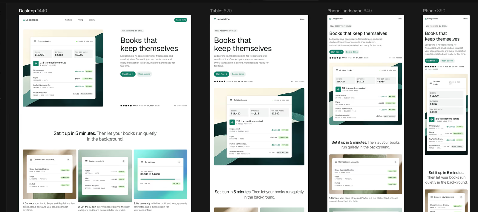
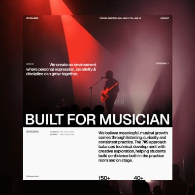
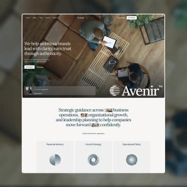
Desktop, tablet and two phone sizes next to each other, with zoom and pan like the design tools you already know.
Works with
BYQ Website Builder
The Canvas shows the page you are on at four screen sizes, side by side, so you see how a change lands everywhere at once. Everything on it is your real site, not a picture of it.
One page at four screen sizes.
The four frames
Desktop 1440: a 1440 px wide screen.
Tablet 820: 820 px.
Phone landscape 640: 640 px.
Phone 390: 390 px.
These are your site's breakpoints. Use Go to a page in the top bar to change the page, and all four frames switch to it.
How edits carry across sizes
Edits flow down from the larger screens, the way they do in other design tools:
An edit you make on Desktop applies to every smaller size too.
An edit you make on Tablet applies to Tablet and the sizes below it, but not to Desktop.
The same goes on down: a Phone edit stays on Phone.
So start on Desktop for changes that should hold everywhere, then go to a smaller frame to adjust only that size, like a smaller heading or a stacked layout.
Move around the canvas
Pan: scroll with two fingers, hold Space and drag, or drag the empty canvas.
Zoom: pinch, or hold ⌘ (Ctrl on Windows) and scroll. It zooms around your pointer.
The zoom menu
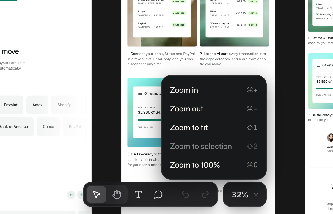
The percentage under the canvas opens the zoom menu.
Zoom in (⌘+) and Zoom out (⌘-).
Zoom to fit (Shift+1): all four frames in view. The canvas opens like this.
Zoom to selection (Shift+2): fills the view with the element you selected.
Zoom to 100% (⌘0).
The zoom menu opens from the percentage under the canvas.
Select and Browse
In Select, click anything on any frame to edit it. In Browse, links and menus work like a visitor's. Press V to switch. To see the finished site on its own, use Preview the site (the play button, or ⌥P).
Text and comments on the canvas
Press T for the Text tool and click words to type over them. Press C for the Comment tool and click anywhere to pin a note. See Share a site and collect comments.