Understand How to Work with Variables
Overview of variables in Skeletons Framework
Inside the Variables panel in the BYQ Skeletons Style Guide, you’ll find a modern, scalable variable structure. Below you’ll find a quick breakdown of each group and what it controls.
Layout
Layout variables control spacing, section paddings, max widths, grids, and containers.
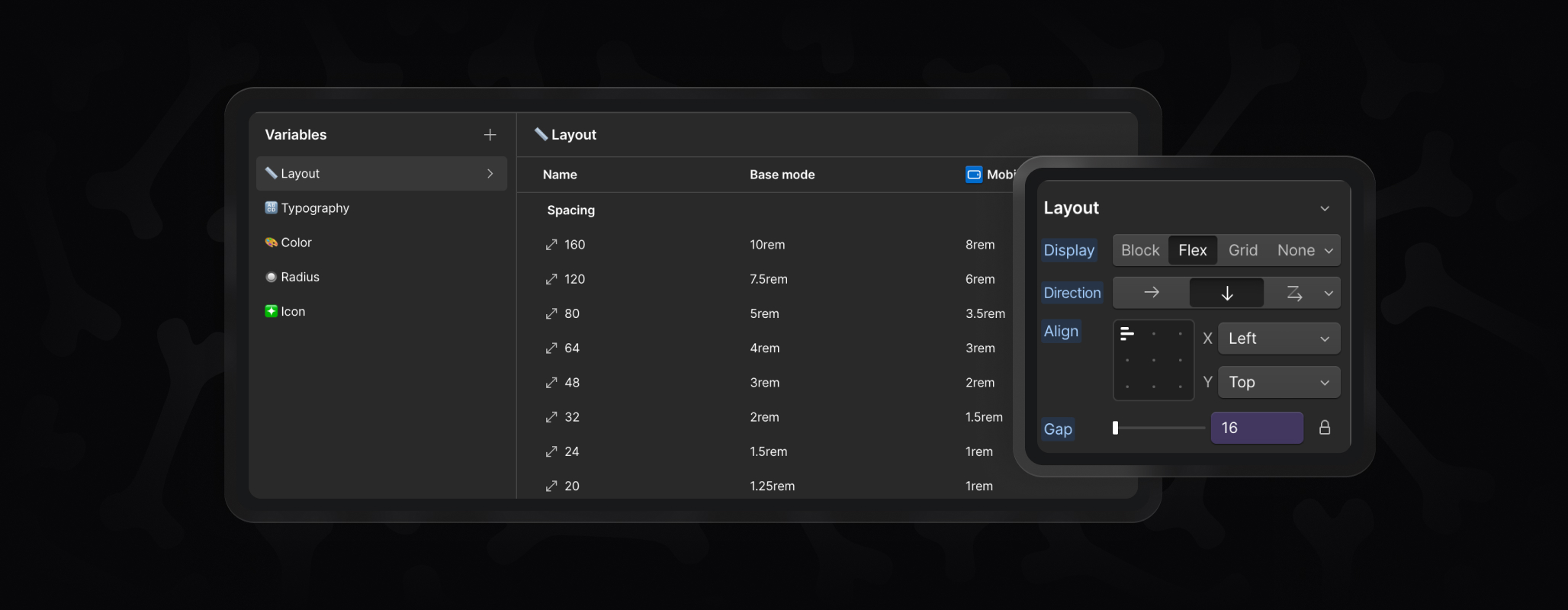
- Spacing – standard increments used across the project. Best to leave these unchanged.
- Section Vertical Padding – good to adjust if you want larger or smaller breathing room between sections.
- Max Width & Grid – usually left as is, though advanced users can adjust if their design calls for different widths or gaps.
- Container (Main / Small) – also typically left alone, but you can widen or narrow containers for specific branding needs.
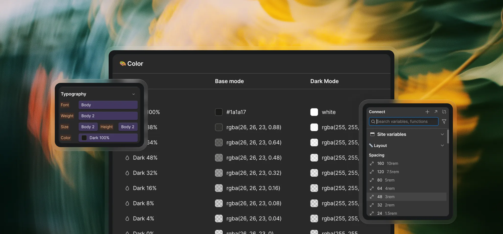
Typography
Typography variables define fonts, weights, sizes, and spacing.
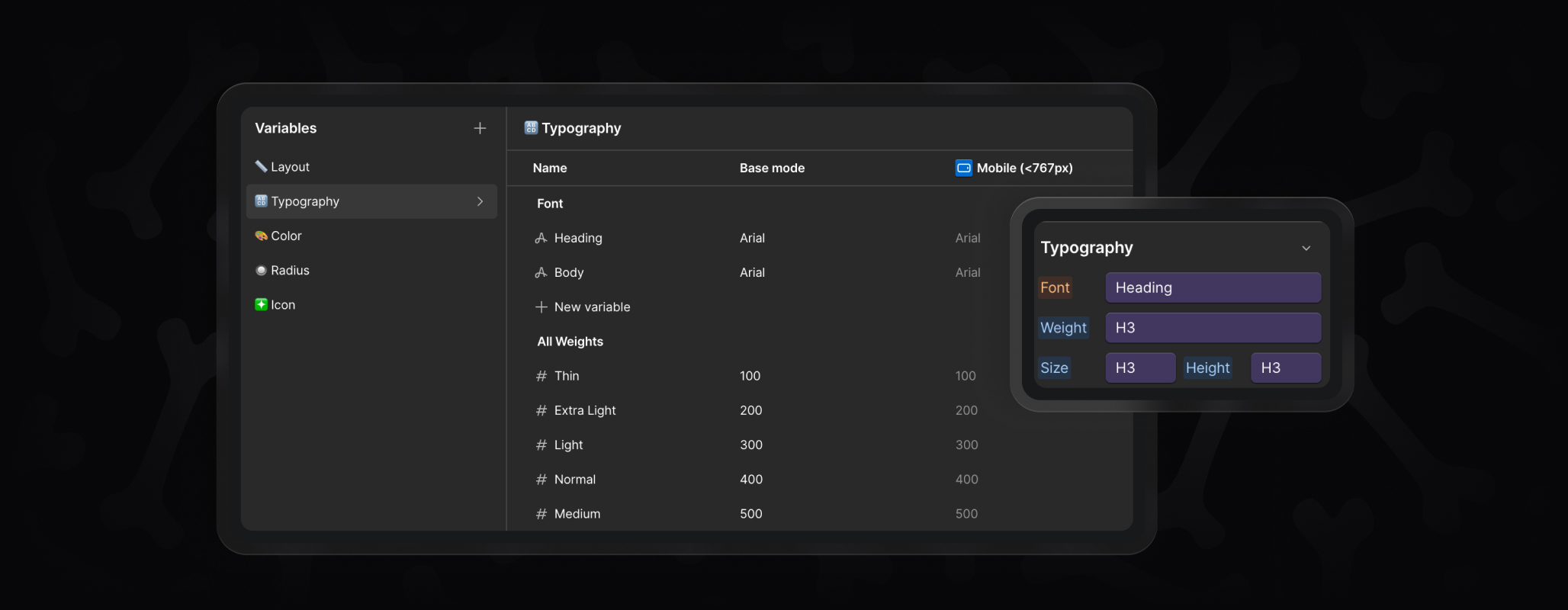
- Fonts – one variable for headings and one for body text. Swap these to set your brand’s typefaces (including custom fonts).
- All Weights – system values, don’t change.
- Font Weight – safe to adjust. Connect headings, buttons, or labels to different weights if you prefer bold, thin, or medium.
- Font Sizes – fully customizable. Update heading sizes, body text, buttons, and labels to match your style.
- Line Height & Letter Spacing – fine-tune these after changing font sizes to keep text balanced and readable.
Color
Skeletons come with a light theme by default, but variables cover both base mode and dark mode.
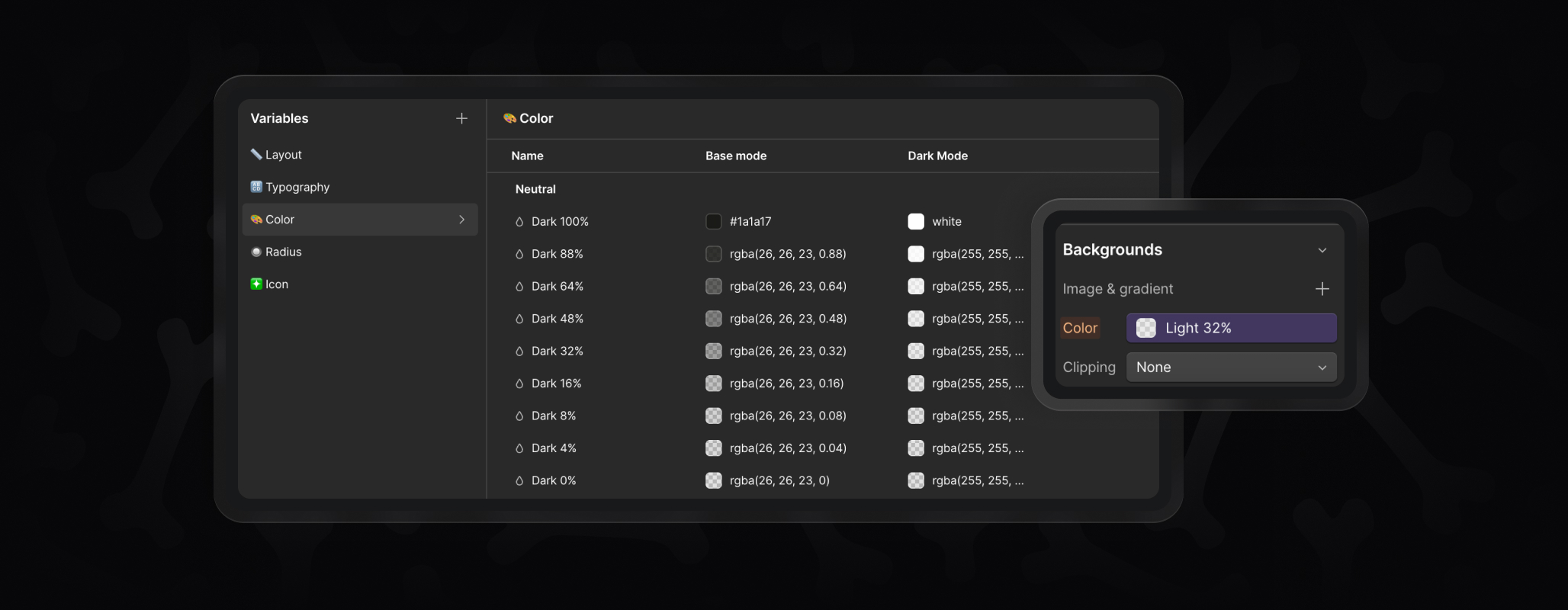
- Dark / Light Neutrals – set your primary text colors here. Pick a main dark (for body text) and light (for reversed text), then fill in the opacity steps (88%, 64%, etc.) for borders, hover states, and subtle layers.
- Backgrounds – define your brand’s surface colors (background 1, 2, 3, etc.).
- Accents & UI – accents for highlights, plus UI colors like error, links, or transparent states.
Radius
Radius variables control corner rounding.
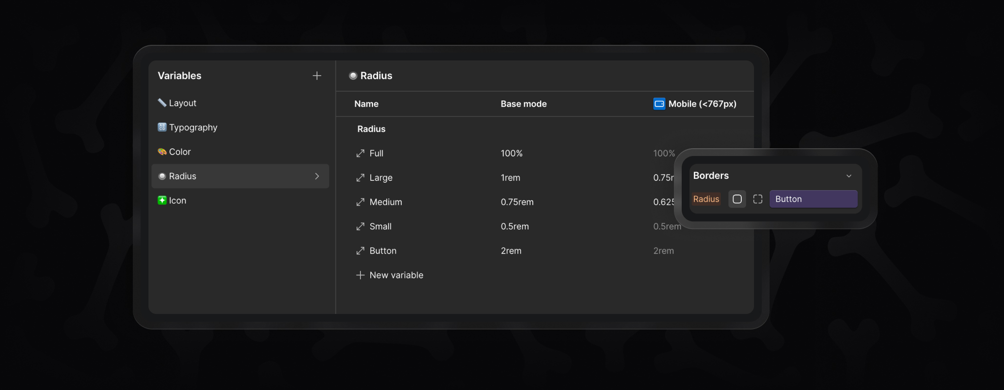
- Full – always 100%, leave as is.
- Large / Medium / Small / Button – adjust these to match your brand’s overall feel, from sharp and minimal to softer, rounded edges.
Icon
Icon variables manage icon sizing and stroke.
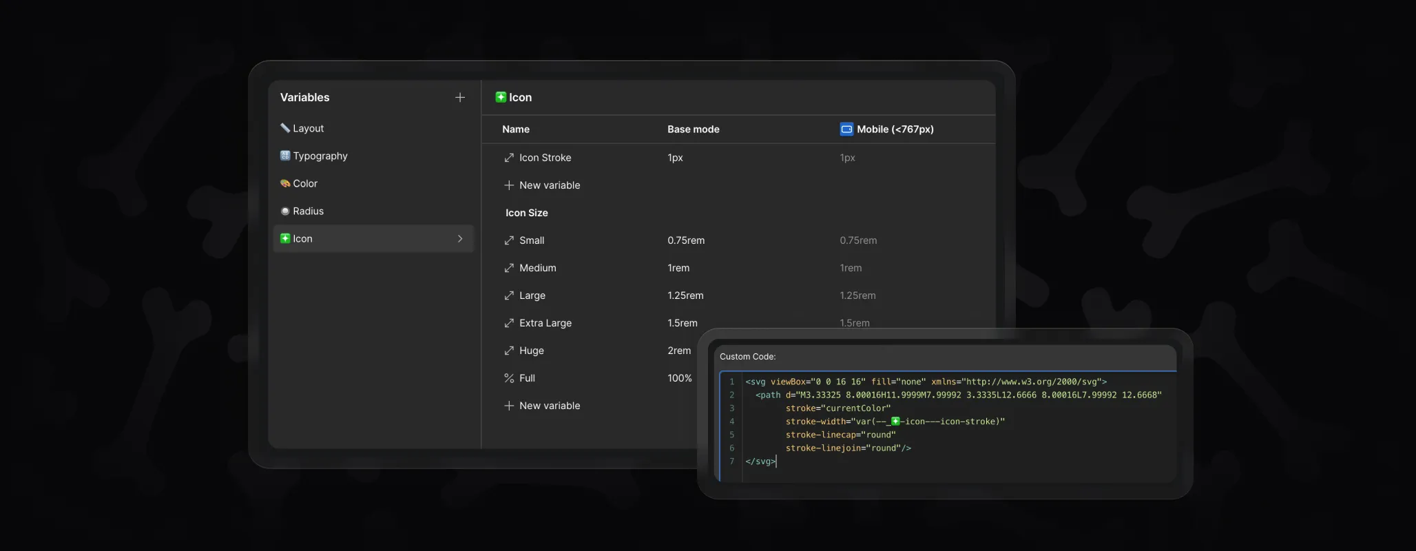
- Icon Stroke – update once, and all embedded icons follow.
- Icon Sizes (Small → Full) – generally fine to keep as is, but you can resize globally if your project calls for different proportions.
Key Takeaway
Not every variable needs changing. Use them where it makes sense — fonts, colors, section paddings, radius — and leave the rest as they are to keep things consistent. By relying on variables, you ensure that every Skeleton you paste adapts instantly to your brand without manual restyling.