


AI & MCP
A design system your AI can actually read
Ask any AI for a pricing section and you get the same pricing section. Here's the file that changes that, and how to use it.
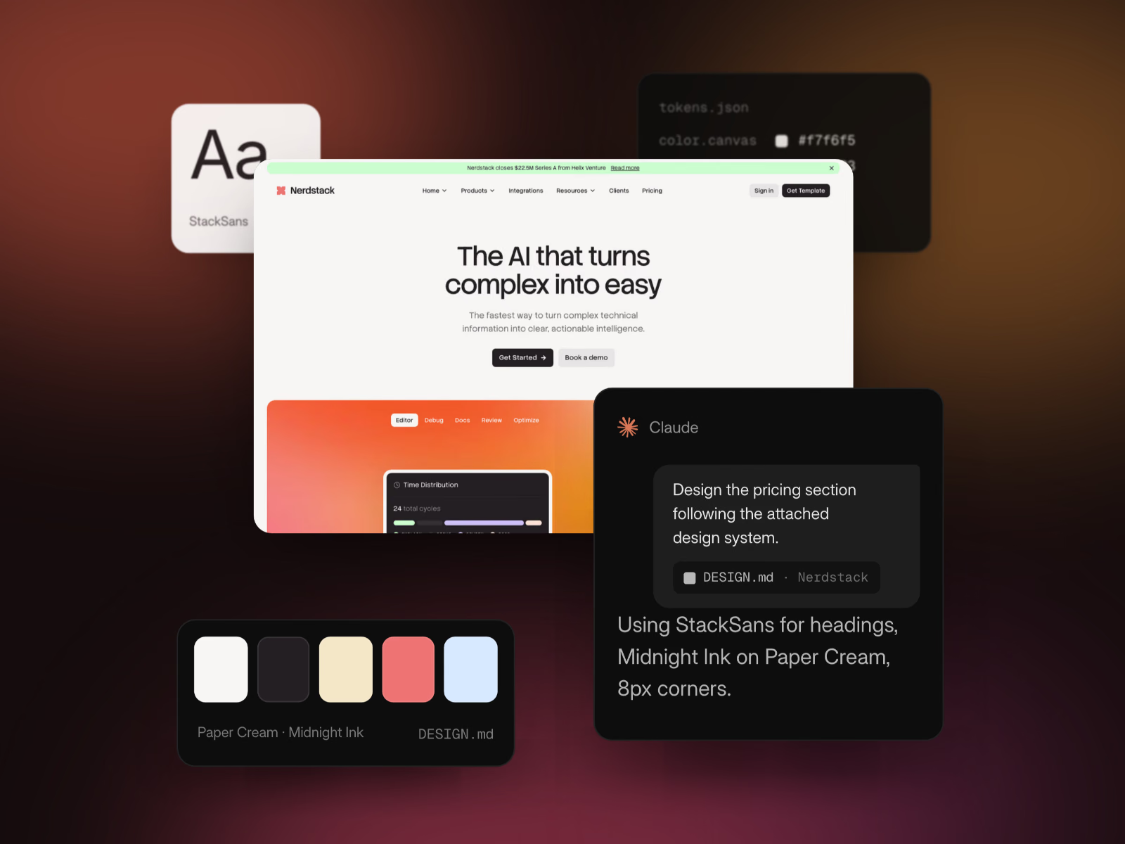
Ask any AI for a pricing section and you get the same pricing section. Here's the file that changes that, and how to use it.
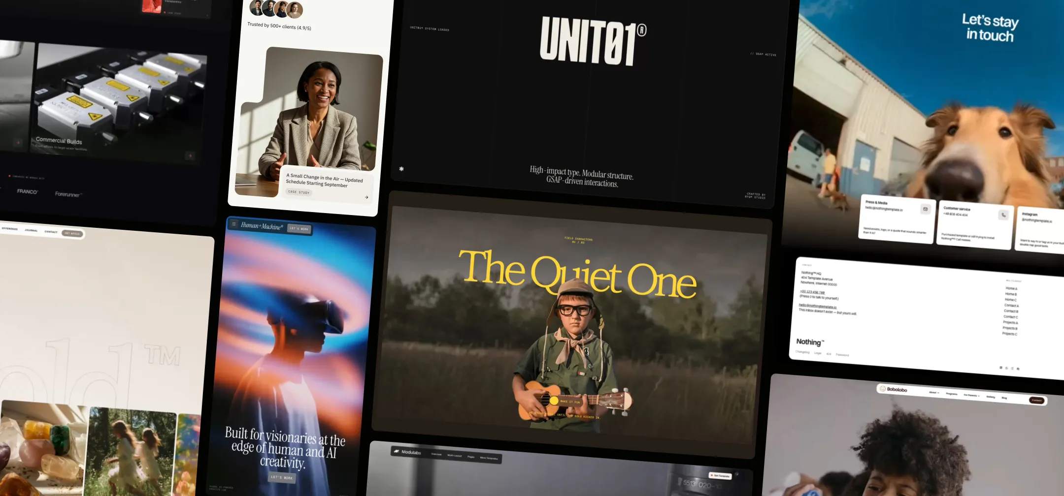
Copy-paste sections for Webflow, Figma, Framer, Shopify and your AI tools.
Ask an AI for a pricing section. Any AI, any day.
You'll get three cards in a row. White background, a thin grey border, a blue button that says "Get started". A price in bold, three features in grey, a little rounded corner. It will be perfectly competent, and you've seen it a thousand times.
That's not a failure of the model. It's what you get when you ask a very capable thing to design something and tell it nothing about who it's designing for.
Think about what a human designer does before they draw a single card. They look at the brand. They notice the cream background and the way the headlines are set in a serif at a regular weight. They notice that nothing on the site is pure white, and that buttons are pills, not rectangles. They pick up the voice. By the time they open a blank canvas, they already know what "on brand" means.
An AI starts with none of that. So it reaches for the average of everything it has seen, which is the pricing section everybody gets.
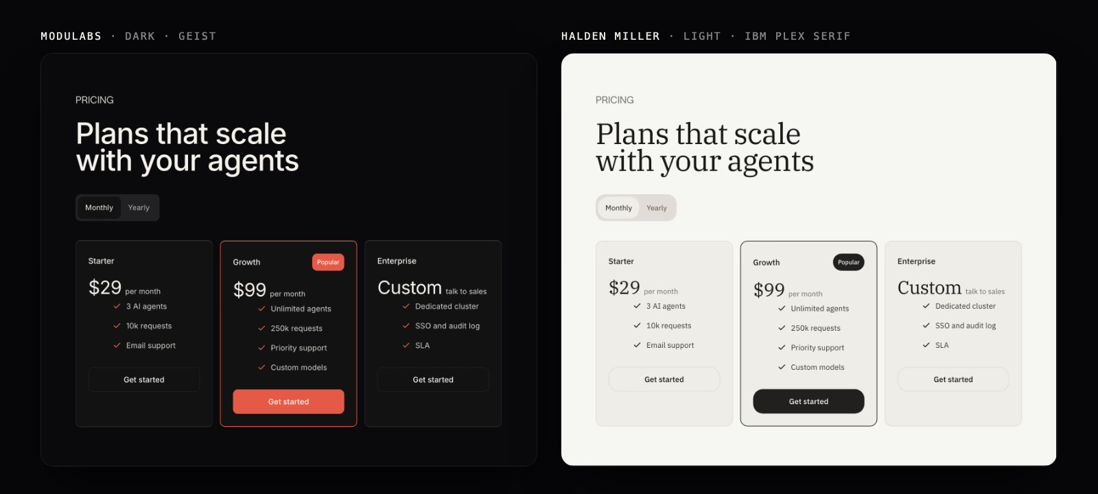
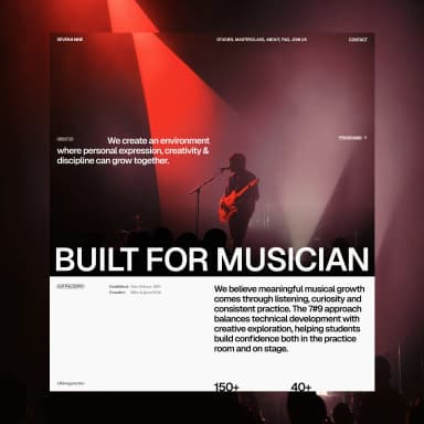
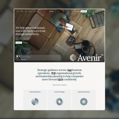
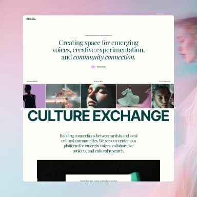
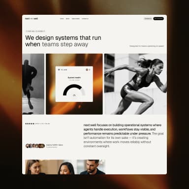
Here's what that looks like. Same section, same words, same markup. The only thing that changed is the design system behind it. The colours, the typeface, the corner radius and the shadow all come from the file.
The fix isn't a cleverer prompt. It's giving the AI what the designer had: the context.
A design system is the brand, written down in a form a machine can use. The colours, but also the roles they play. The type, but also which voice speaks where. The spacing, the shapes, the layers of depth. And, crucially, the rules: what to do, and what never to do.
You'll hear "design tokens" and "design system" used as if they mean the same thing. They don't, quite. Tokens are the atoms: this hex code, that pixel value, this font weight. A design system is the tokens plus the rules around them, the voice, and the logic of what sits on what. Tokens tell the AI what exists. The system tells it how to behave.
Every BYQ template carries one. We've pulled them out into files you can hand to an AI, and there are 300+ to choose from, including ones from well-known brands and ones you can generate from your own site.
Open any design system on BYQ and you'll find eight sections. Each one answers a question the AI would otherwise guess at.
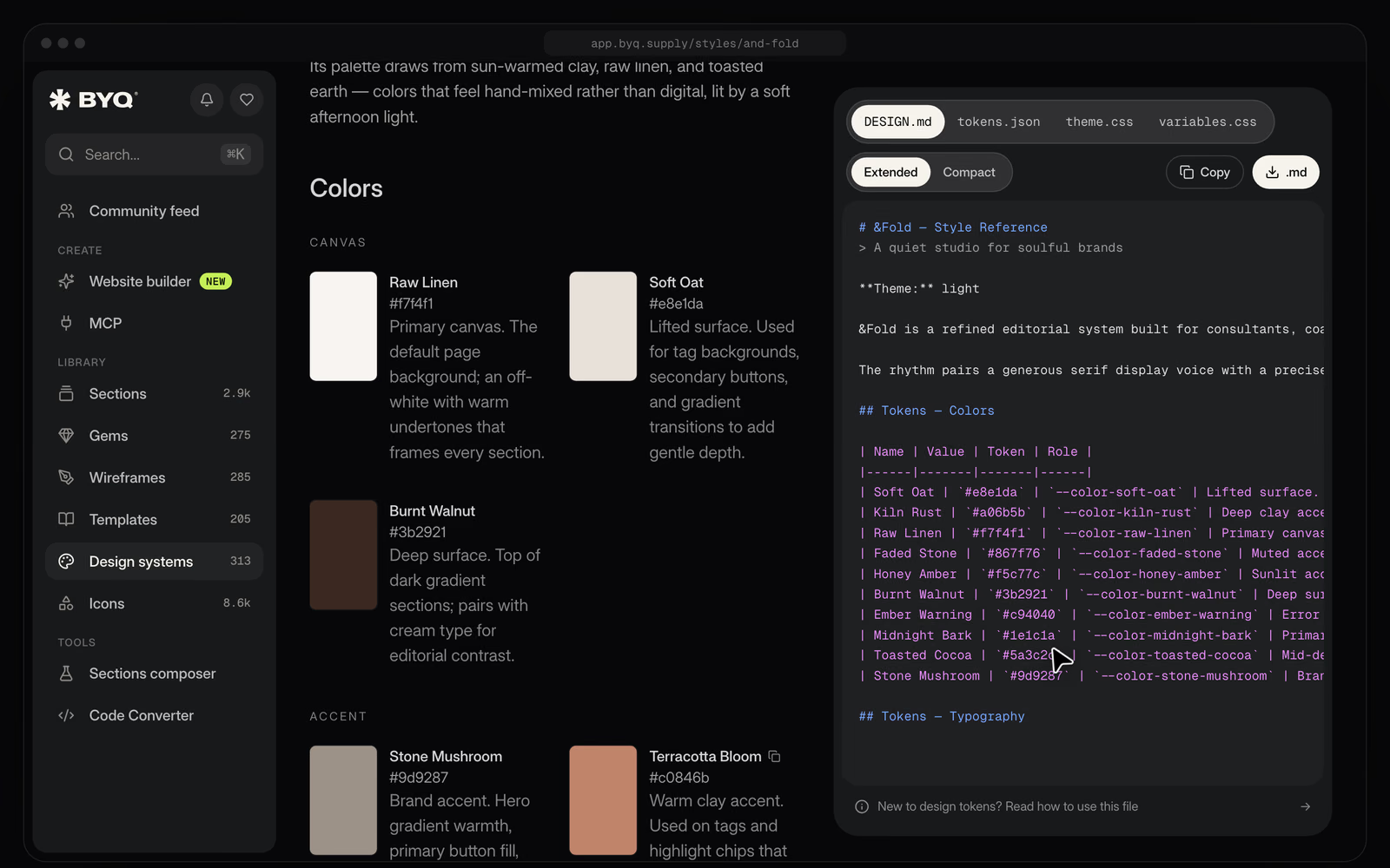
Most of them do what you'd expect. Colours come grouped by role, so the AI knows the difference between the canvas, the ink, and an accent that only appears on warnings. Surfaces are a ladder of layers, so it knows what floats above what.
The one that surprised us is do's and don'ts. They're short, opinionated, and pulled straight from the template's own rules. Things like anchor every page on Paper Cream and let Lift White cards float above it, or don't bold the headlines, because the type system relies on a regular weight.
It looks like the least technical part of the file. In practice it's the part that most changes what comes out, because it stops the AI from doing the helpful, generic thing.
Every design system comes as four files. They hold the same information, shaped for different tools, so the only real question is where you're going to use it.
Claude, Cursor, Lovable, v0. The rules, roles and example prompts.
Named tokens. Import with the free Tokens Studio plugin.
A drop-in @theme block. Every token becomes a utility.
Plain custom properties. Works wherever CSS does.
DESIGN.md is the one most people start with. It's a single markdown file written for an AI to read: the colours with their roles, the type scale, the spacing, the surfaces, the do's and don'ts, and example prompts. Drop it into a chat and the AI knows how to design in that style.
tokens.json is for Figma and developer tooling. It follows the Design Tokens Community Group format, and in Figma you bring it in through the free Tokens Studio plugin.
theme.css is a drop-in block for Tailwind v4. Paste it in and every token becomes a utility class.
variables.css is plain CSS custom properties. It works anywhere CSS does, which makes it the safe fallback.
You can use more than one. A pairing we like: DESIGN.md for the AI, and theme.css or variables.css for the code, so the AI designs against the same values it can see in your project.
It takes about a minute the first time.
1. Pick one. Browse the library, open a design system, and look at the colours and type to see if it's the mood you want.
2. Download the DESIGN.md. (You'll need a Pro or Ultra plan to download the files. Anyone can view a design system.)
3. Attach it, then ask. Open Claude, attach the file, and be explicit that you want the system followed, not just acknowledged:
Using the attached design system, design a pricing section with three plans. Follow its colours, type, spacing and do's and don'ts.That second sentence matters more than it looks. "Here's a design system" gets you a polite nod. "Design this following the design system" gets you the system.
4. Go one section at a time. AI handles a single, well-scoped section much better than a whole page in one go. Build up piece by piece.
5. Re-attach when it drifts. In a long chat the context thins out and the colours start wandering. When that happens, paste the file back in or tell the AI to follow the system again. It fixes most drift.
A few things we've seen make a real difference.
Pair it with a screenshot. Attach the DESIGN.md, then attach a screenshot of a section from a site whose layout you like, and ask for that layout in this style. You get the structure you wanted with the personality of the system.
Build a section with the same layout as the screenshot, but in the style of this design system.Turn it into a Claude Skill. If you'll use the same system again and again, paste the DESIGN.md into a chat and ask Claude to adjust it so it works as a Skill. Save it, and Claude will load the system whenever it's needed without you attaching anything.
Use the extended version first. Every file comes in Extended and Compact. Extended carries the full descriptions and example prompts. Switch to Compact only if you hit context limits.
A quick word on where these come from. Every design system marked "Made by BYQ" is extracted from one of our own templates, which means each one also ships with that template's sections in the library. Same look, finished blocks to match.
With 200+ of them, choosing is the hard part. These are the six we reach for first, picked because no two of them feel alike.
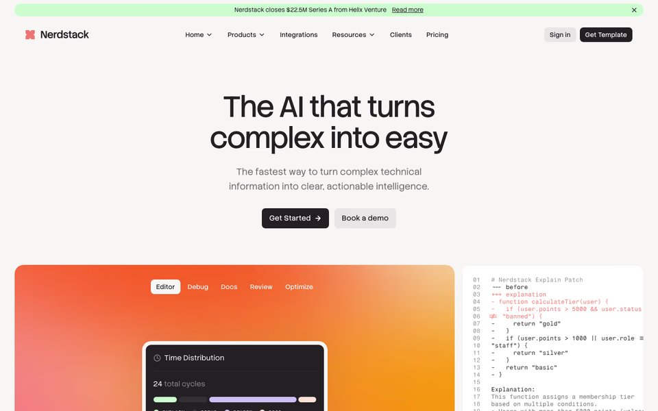
Clean and technical, made for developer tools and AI products.
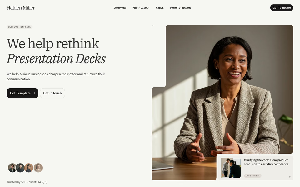
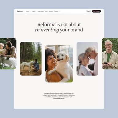
An editorial serif system, calm and confident.
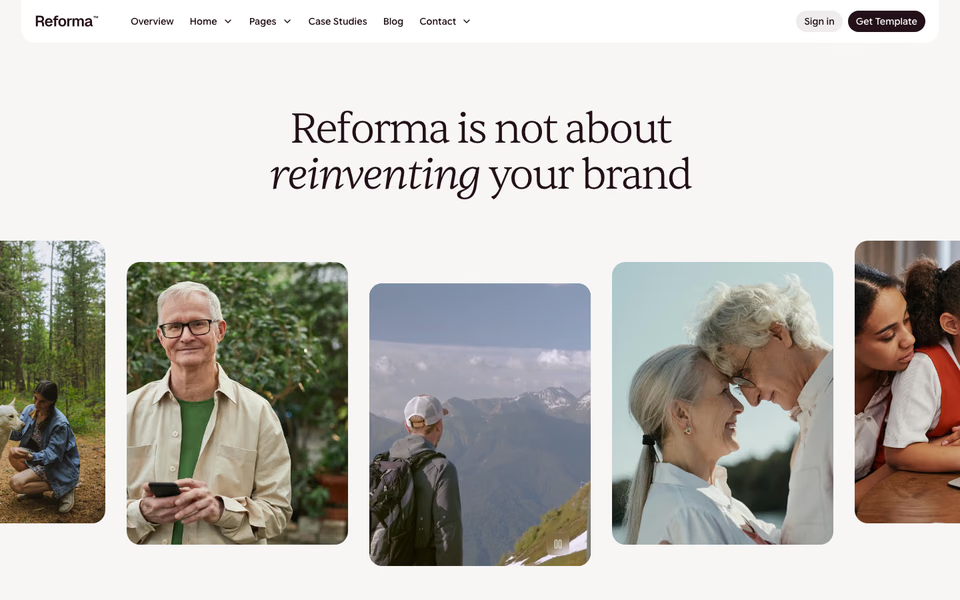
Credibility through considered design.

Clarity, trust, substance.
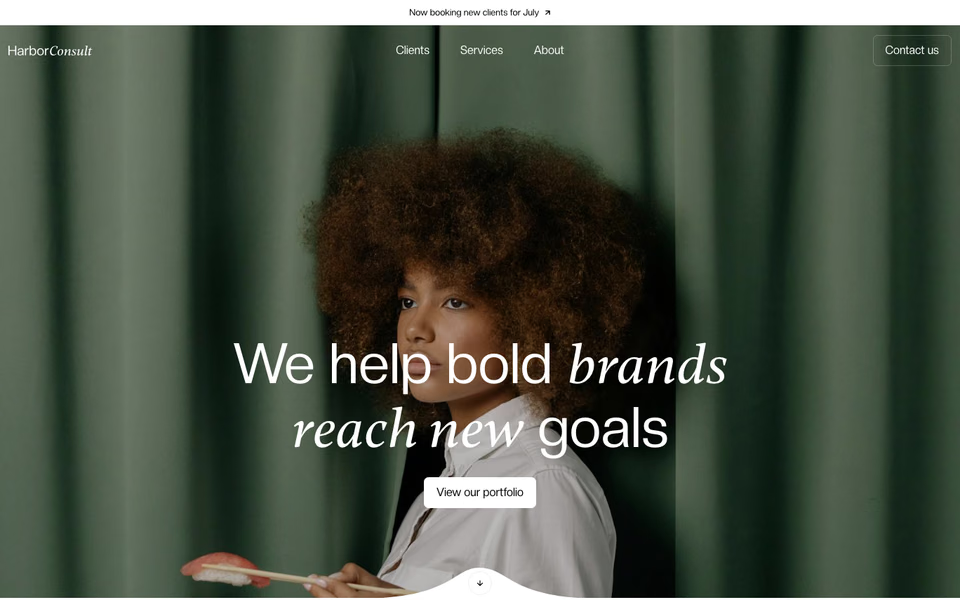
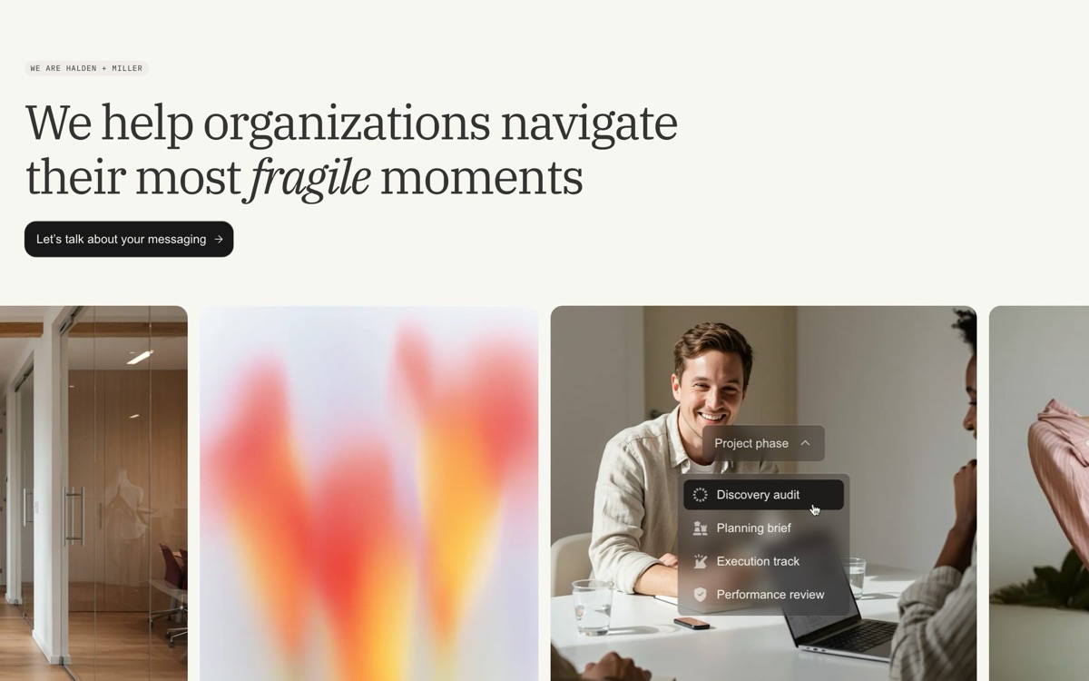
A quiet, editorial system for professional services.
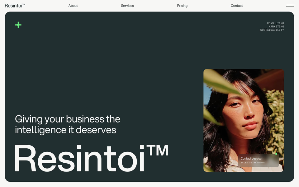
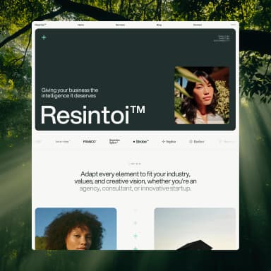
Organic and modern, made for environmental brands.
Open any of them to see the colours, type and do's and don'ts before you download anything. Looking is free.
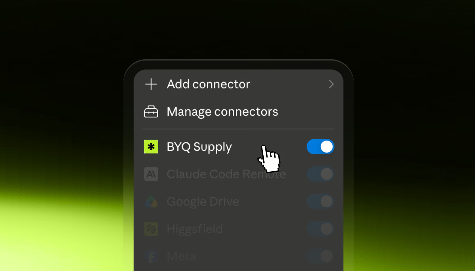
If BYQ is connected in Claude, you can skip the downloading. Ask for the system by name and make it the first thing that happens in the project.
Pull the Halden Miller design system from BYQ and use it as the styling foundation for this project.Do this before a single section exists. Setting the direction once, when it's cheap, is the difference between pages that agree with themselves and pages that don't. (There's more on that in the connector post.)
You're not limited to the ones we ship. Point BYQ at a website, usually your own, and it builds a design system from it: colours, type, spacing and components, plus the files. It costs about 1 BYQ AI token, and the result lands in your account under "Made by you".
A few notes from the docs, because they save a wasted try: use a page with your real branding, like your homepage, rather than a login screen, and expect the cleanest result from a site with a clear, consistent palette. Free accounts can keep up to five generated systems. Pro and Ultra keep as many as they like.
A builder site starts from a template and keeps that template's look. It comes with four designed themes and an Inverted one, and the Style panel covers colours, fonts, spacing and buttons for the whole site, free and instantly. For most changes, that's all you need.
What it doesn't have is a button that applies another design system. That's a bigger change, and the builder's assistant does it in the chat. Ask for a different look, or name a system, and it picks one and tells you which. Then it re-themes the site and rebuilds every section from that system's library. Your pages and your words stay.
I don't like this style. Switch the whole site to a different design system, and keep every page and every word.It's a full agent turn, so it uses AI tokens, and every switch is saved as a version you can undo. If you only want other colours, ask for exactly that, or use the Style panel for free.
Claude can't do the switch. The one-step switch isn't available through the connector. Claude can still read a design system from the library (that needs Pro or Ultra) and rewrite your site's colours and fonts to match, but that's a manual edit. If you'd like the full picture of building that way, building in Claude and finishing in the builder walks through it.
Worth being plain about the limits.
It describes style, not components. A design system tells the AI which colours, type and spacing to use. It doesn't define a navbar or a pricing card. If you want finished blocks in the same style, that's what sections are for.
It's not a licence. You get the visual language, not the right to redistribute or resell the original template.
It doesn't import into Webflow or Framer. If you build in Webflow, brief an AI with the DESIGN.md and bring the plain HTML in through the converter. If you build in Framer, use sections.
It's a snapshot. A file you've downloaded won't update itself when a template changes. Re-download when you want the latest.
Don't start with a whole site. Pick a design system you like, attach the DESIGN.md, and ask for one section. Then ask the AI for the same section with no design system attached, and put the two side by side.
That comparison is the whole pitch. We'd rather you see it than take our word for it.