Templates
The right template for the job
Ten project types, the templates that fit each, and a checklist for judging one before you commit a week to it.
Ten project types, the templates that fit each, and a checklist for judging one before you commit a week to it.
Choosing a template badly costs more than choosing none. You spend three days making it fit, then rebuild the half that never will.
So here's the library sorted by the only question that matters: what are you actually building?
Consultant sites have to do two contradictory things at once: prove expertise without a case-study library to lean on, and justify a price without ever showing one. Too plain and you read junior. Too polished and you read like a SaaS product. These three sit at different points on that line.
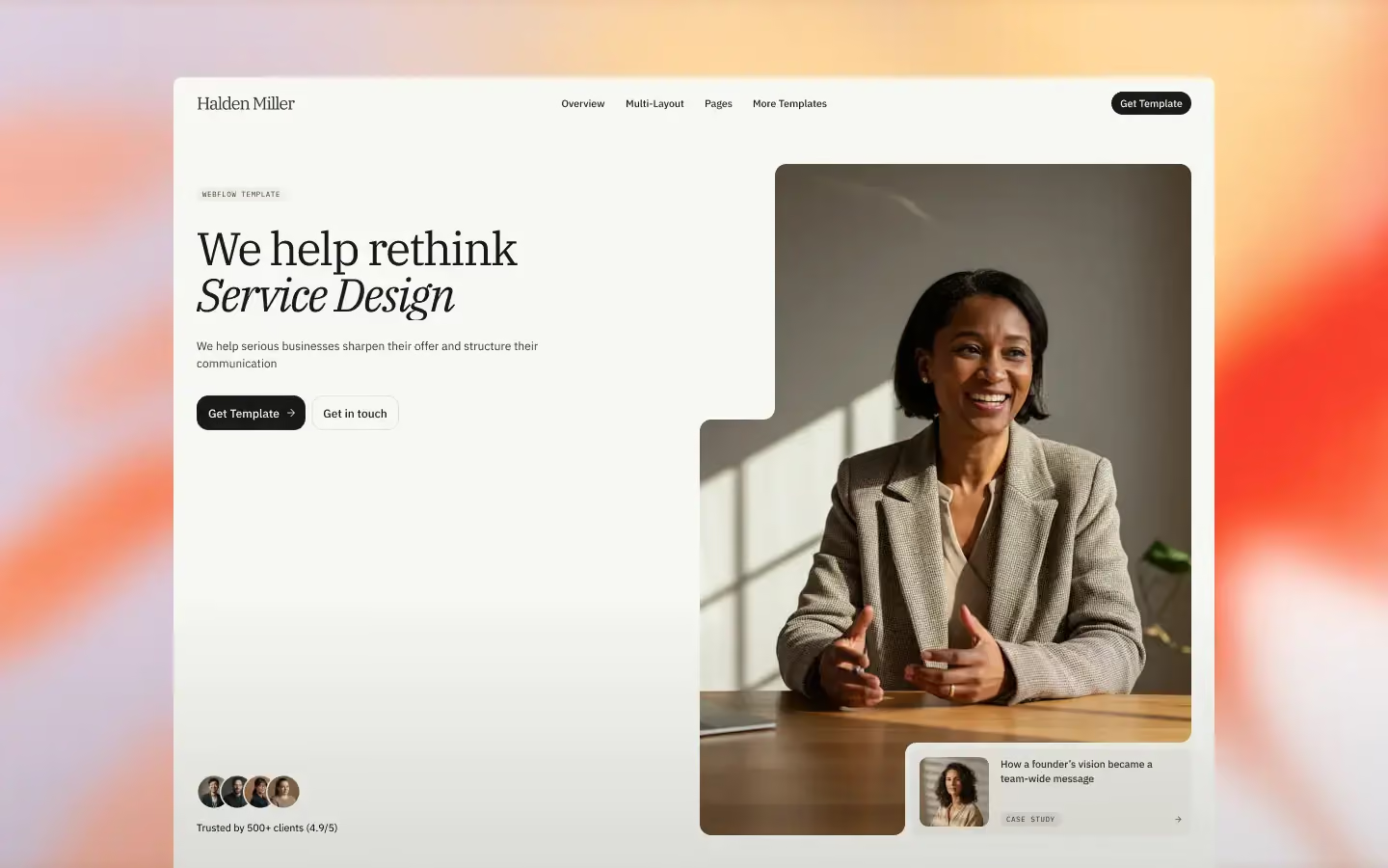
The elegant end. Best when the consultant is the brand — a senior independent, or a small firm with a name on the door. Lives or dies on photography.

For firms that need more than a pretty site. Structured and credible, built for a team rather than one person.
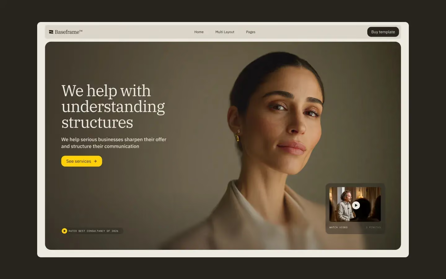
The most systematic of the three. The right call if you'll be adding service pages for years.
The whole job is turning complicated positioning into something a buyer understands in about eleven seconds. Most templates here hand you a hero, three feature cards and a pricing table — fine if your product explains itself, useless if it doesn't.
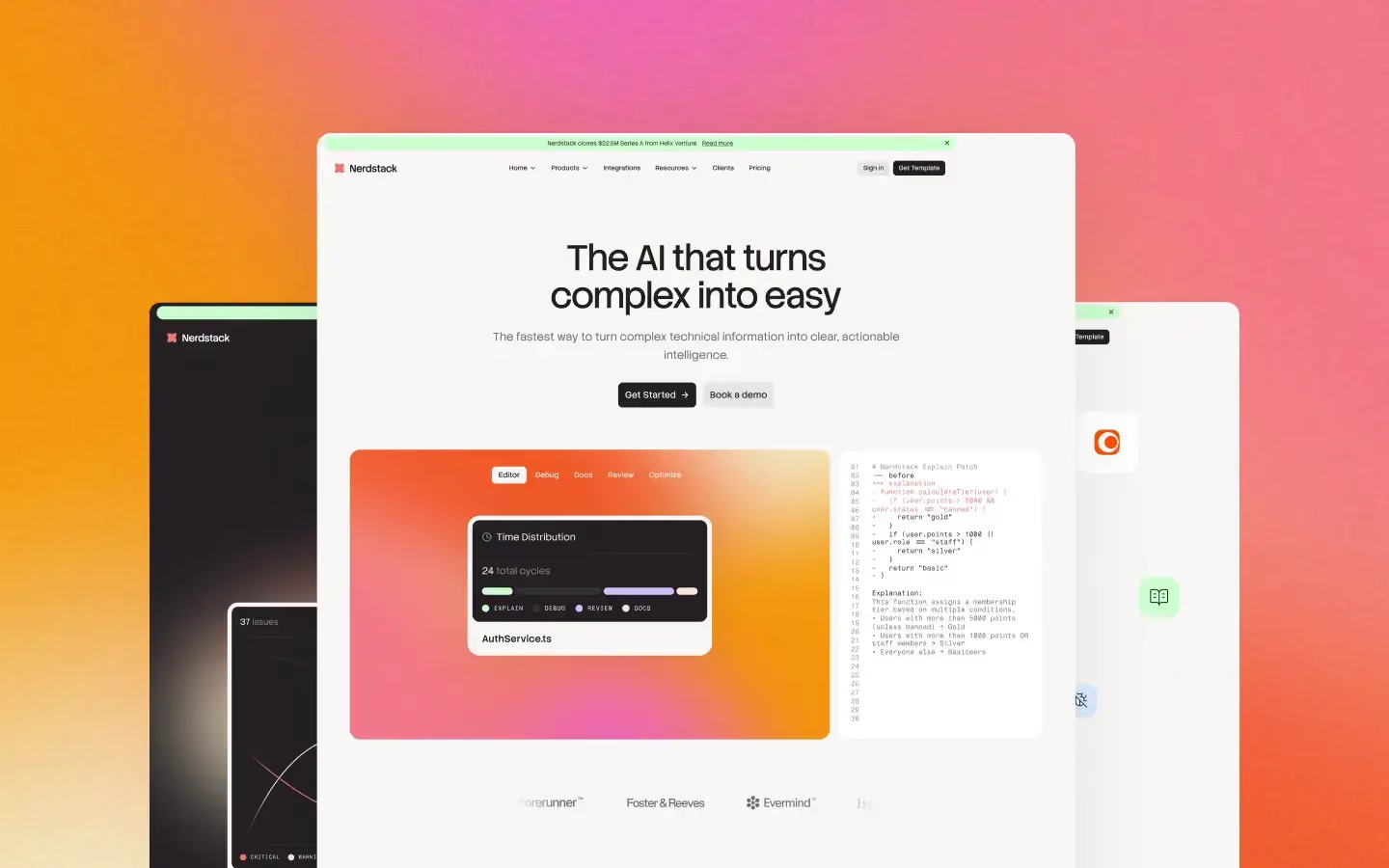
For technical audiences, AI products and developer tooling. Has the layouts for showing how a system actually works.

A product-led layout for software brands — enough structure to carry features, pricing and docs without the page feeling heavy.
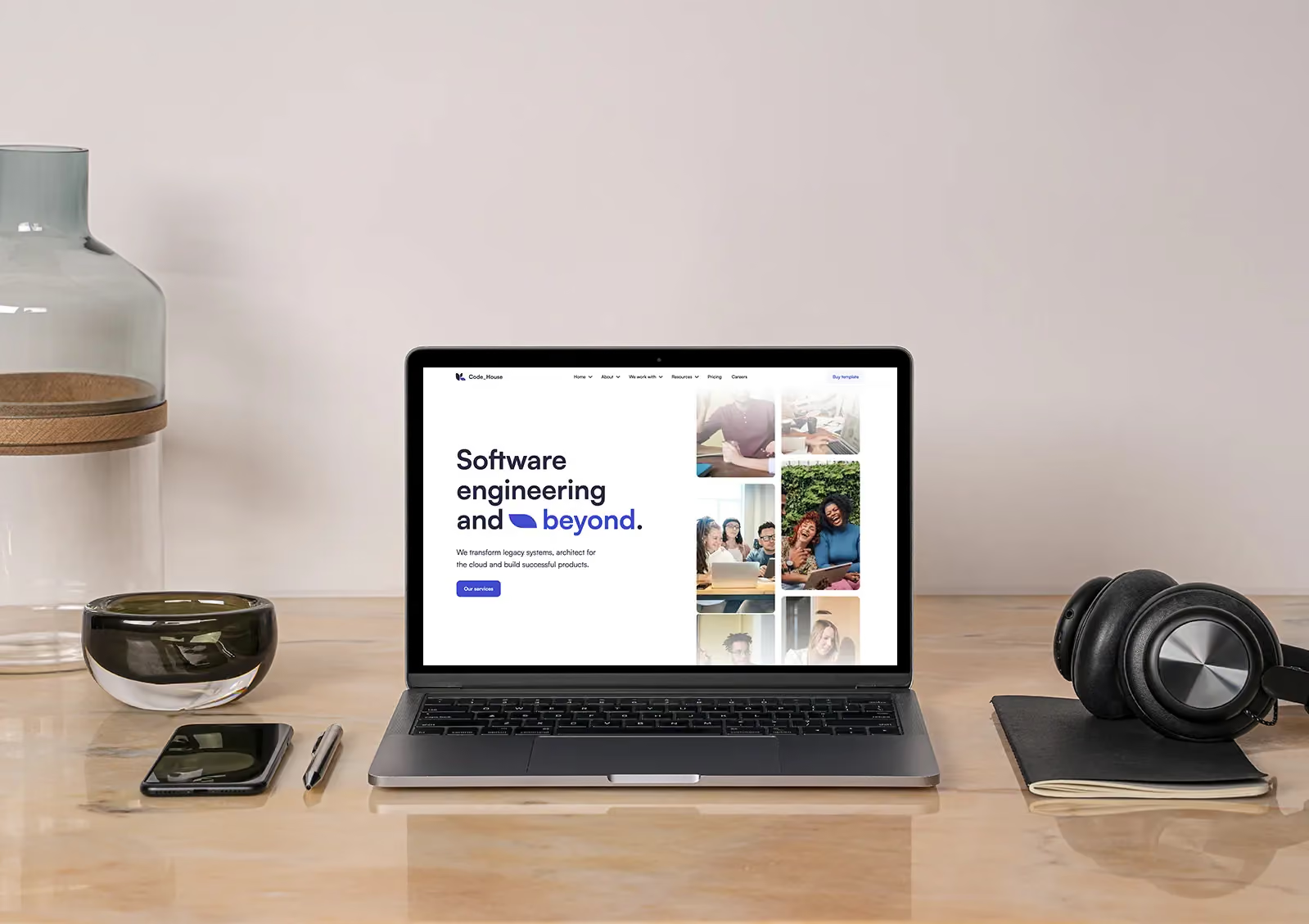
For developer-facing products and technical teams, where the audience reads the code before it reads the marketing.
Here the website is the pitch. A prospect is judging whether you could do this for them based entirely on whether you did it for yourself — which makes this the one category where restraint can genuinely cost you work.
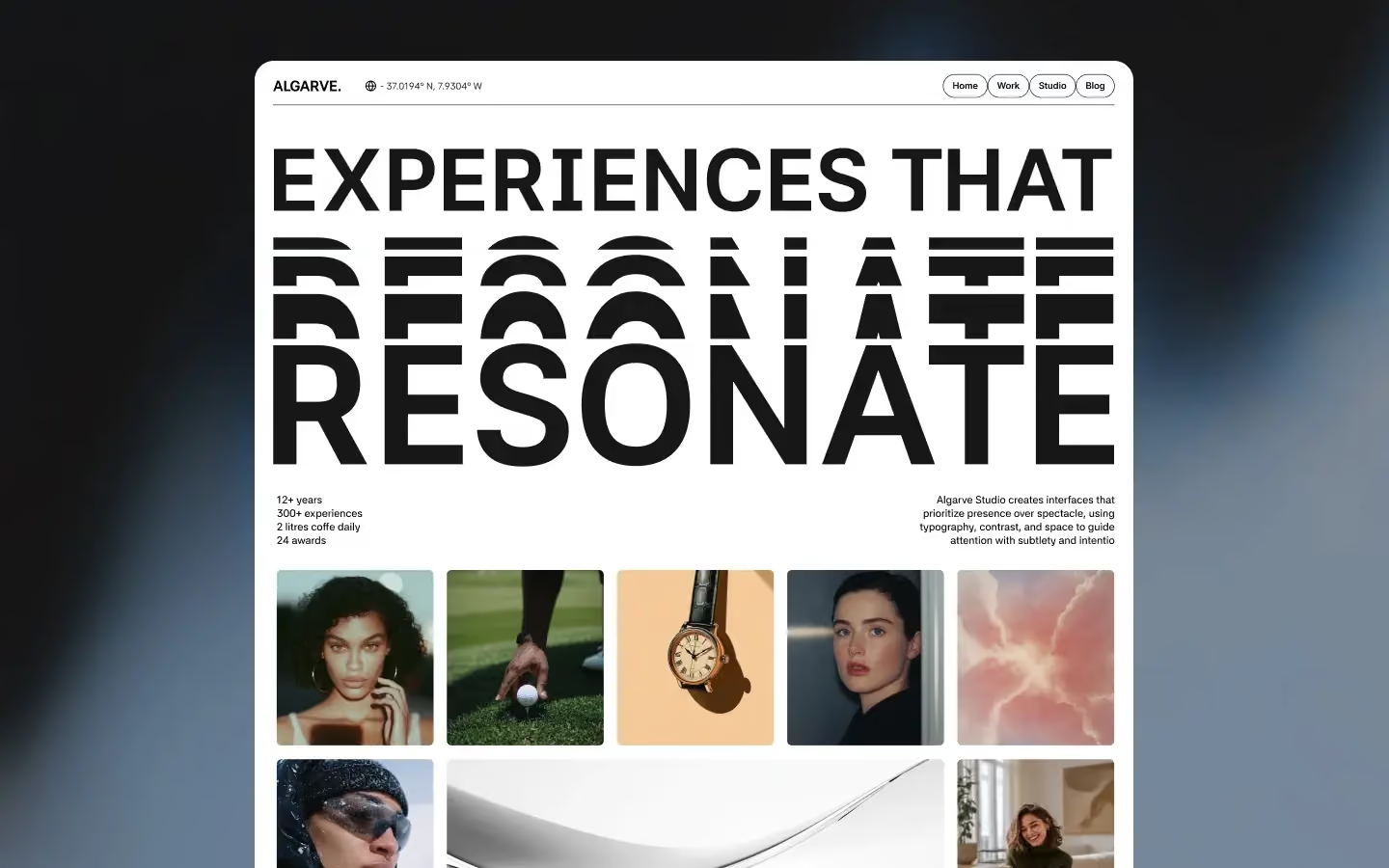
GSAP motion on a full variables system. Pick it when you want the site itself to be the evidence.
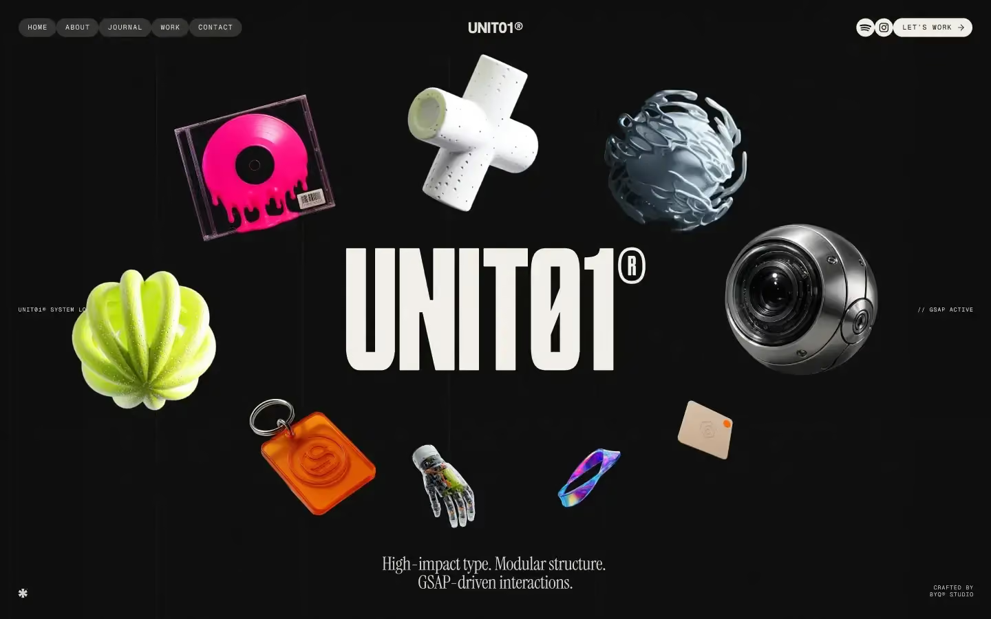
The most structured of the four. Right when your work is really a case-study library and each project needs room to breathe.
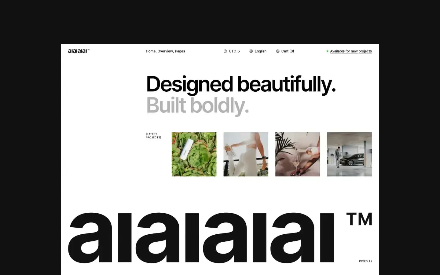
Sleek and modern, built for creative-industry influence. For studios that want the work to lead without the site shouting over it.
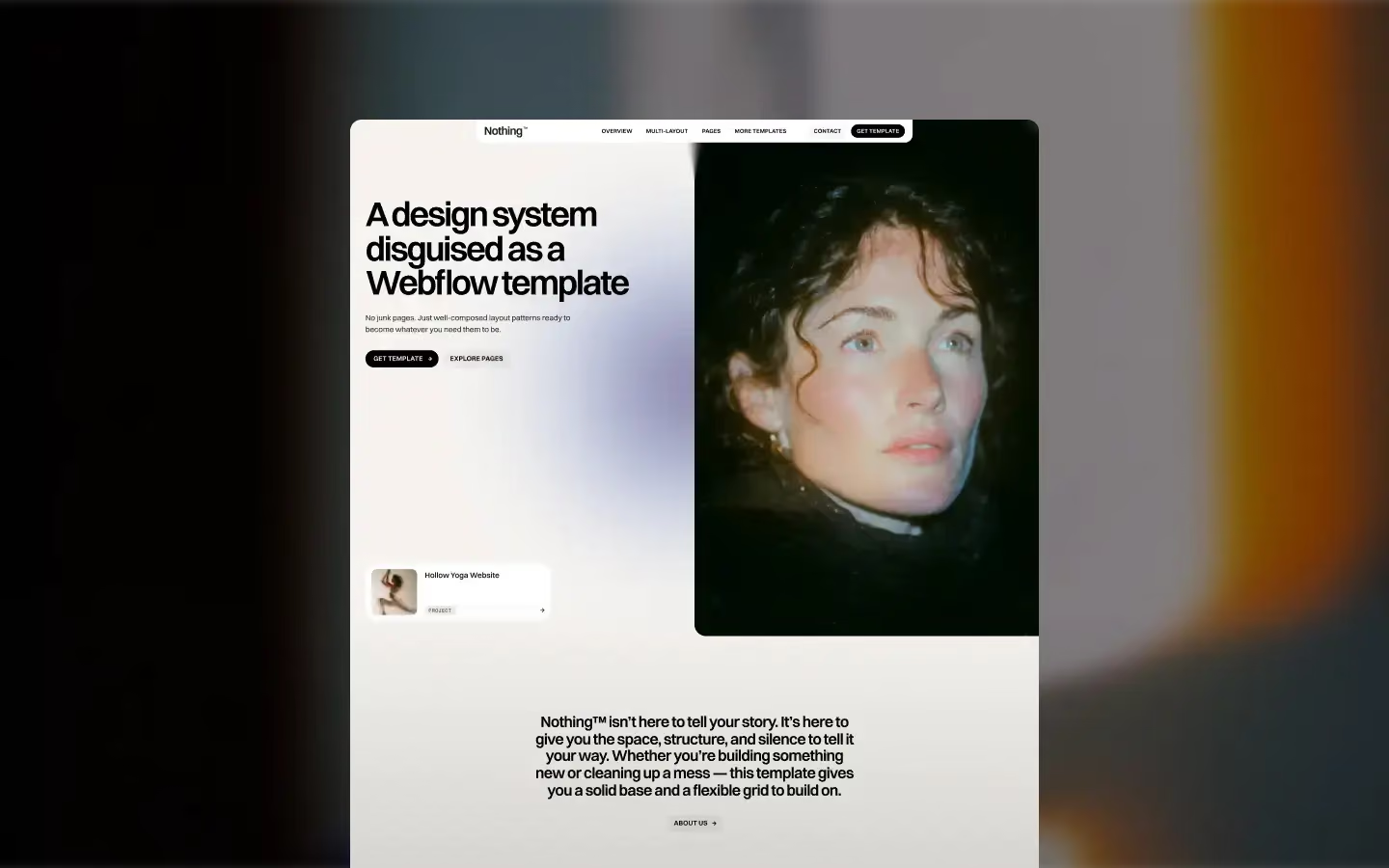
A pure, modular framework built for clarity and creative freedom. The blank-canvas option when you have a strong art direction of your own and want nothing competing with it.
A portfolio template can't rescue weak work, and the good ones don't try. What they do is get out of the way, then frame the two or three pieces you actually want remembered.
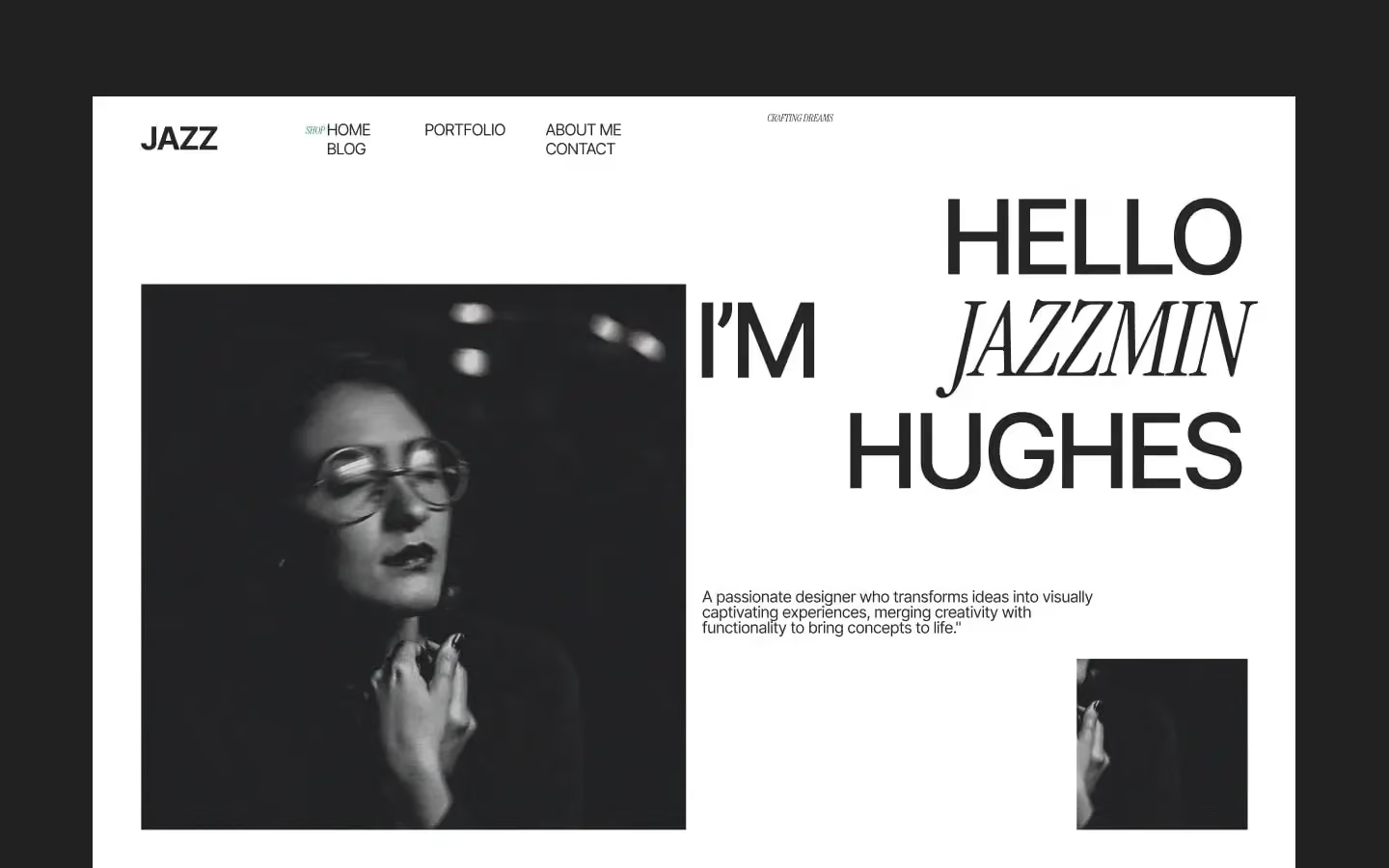
Bold, unconventional, unapologetic. If your work is safe this will expose that. If it isn't, it frames it properly.
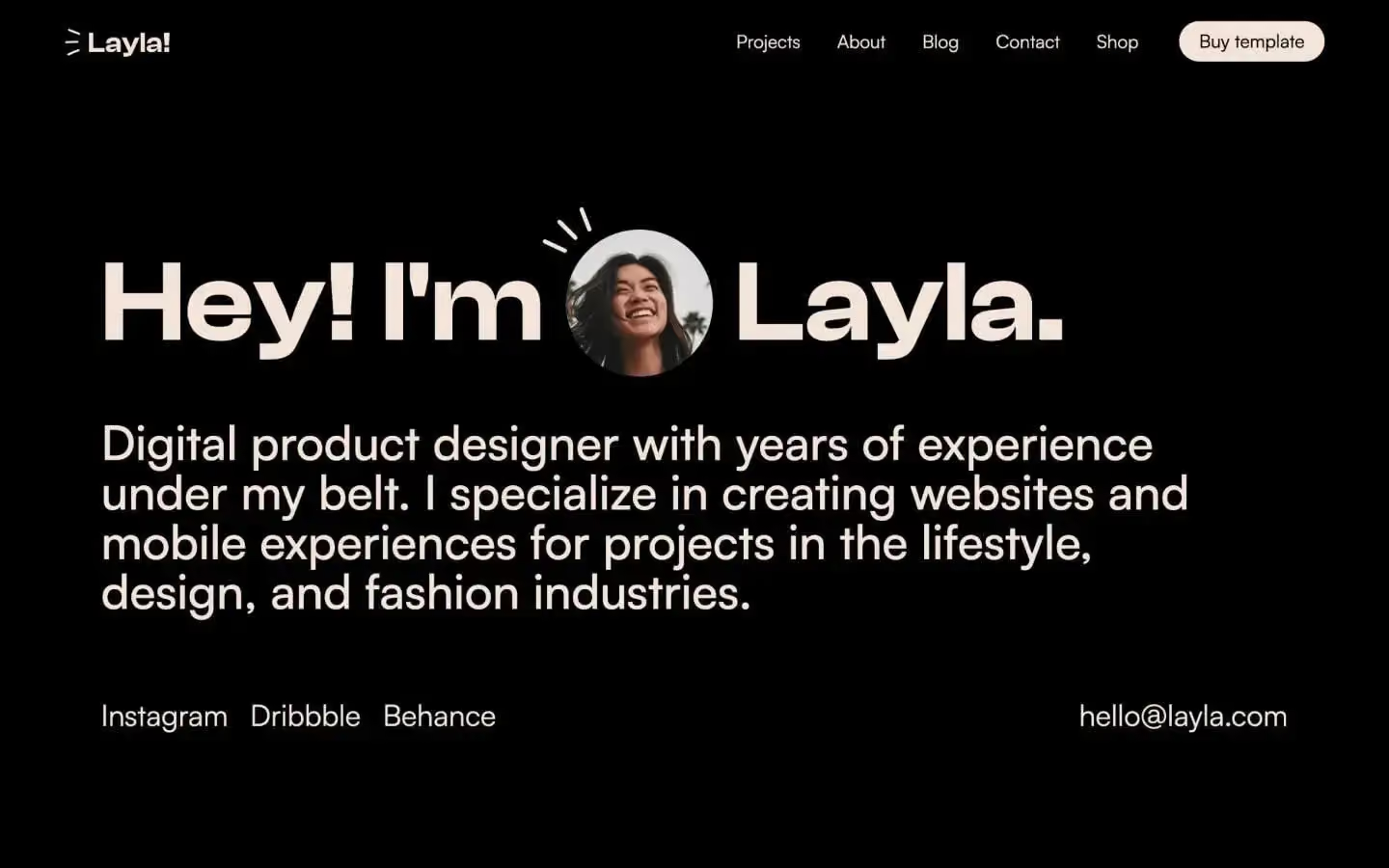
A rich dark theme with expressive layouts and real animation. Flexible project and blog sections, plus a working shop if you sell prints or digital work.
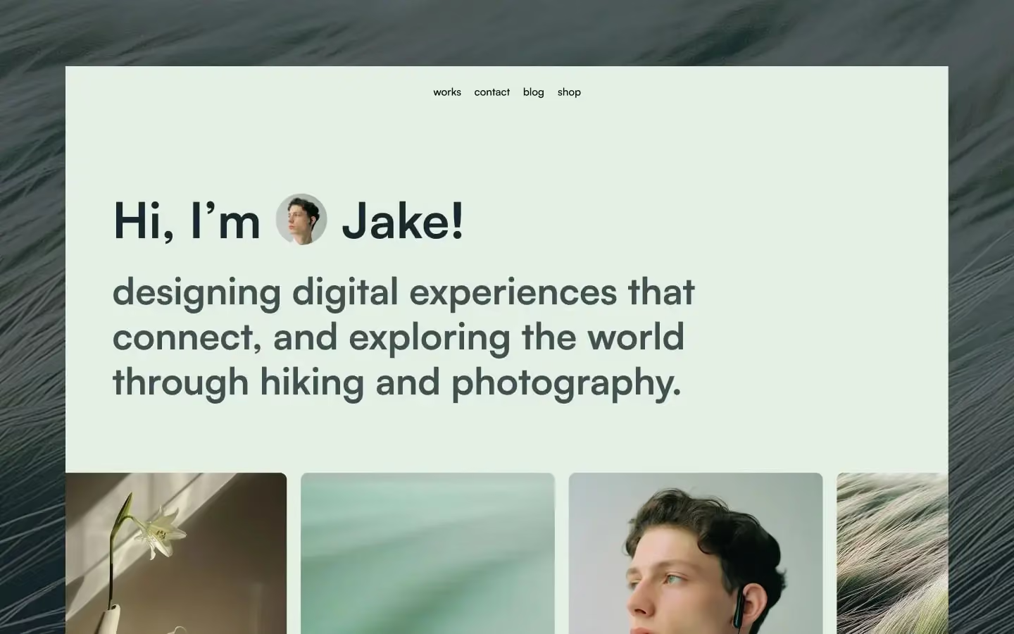
For creatives who front their own name — a personal portfolio where the byline carries as much weight as the work.
A genuinely hard vertical. You need clinical credibility and consumer warmth at the same time, and generic wellness templates give you neither — they land either sterile or spa-like.
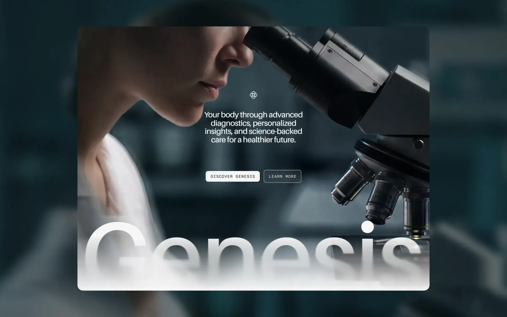
Multi-layout, built for longevity clinics and precision-medicine brands.
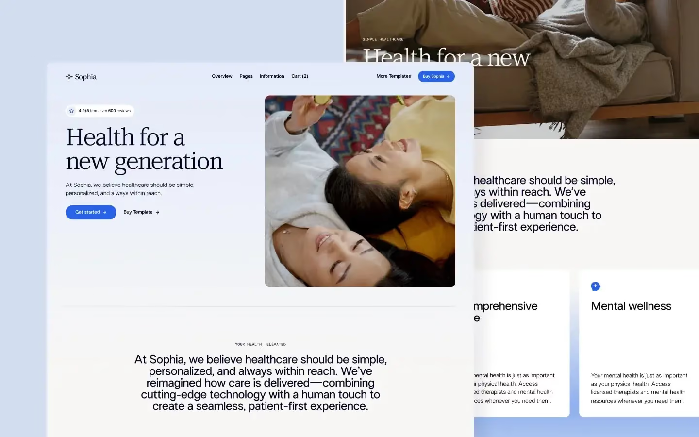
The broader pick. Practices, clinics and health services that need to feel professional and approachable in the same breath.
Two obvious failure modes here, both fatal. Go corporate and you look like greenwashing. Go handmade and you look unserious — a problem when you're asking a board to sign a contract.
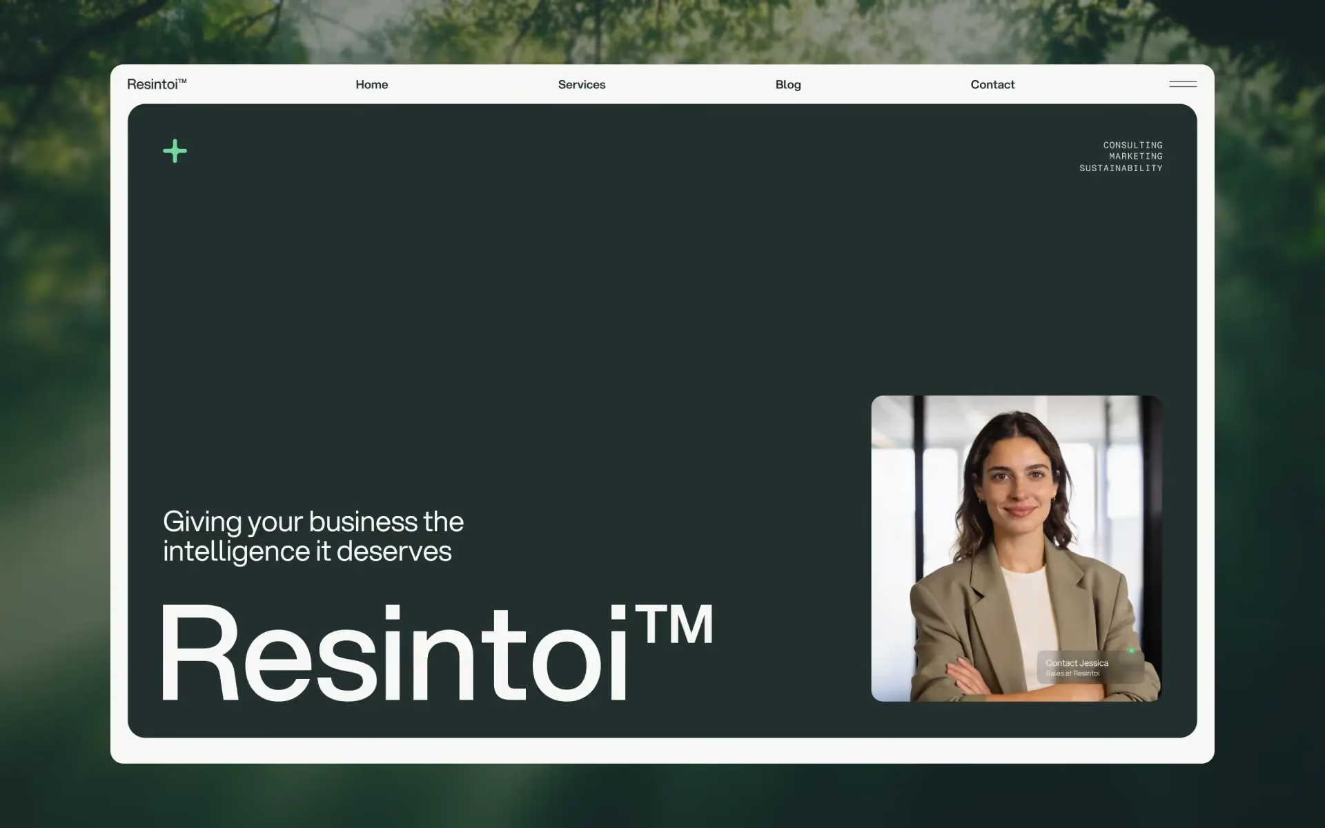
Threads that needle. Warm enough to mean it, structured enough to feel like a business. Built for sustainability consultancies and coaches.
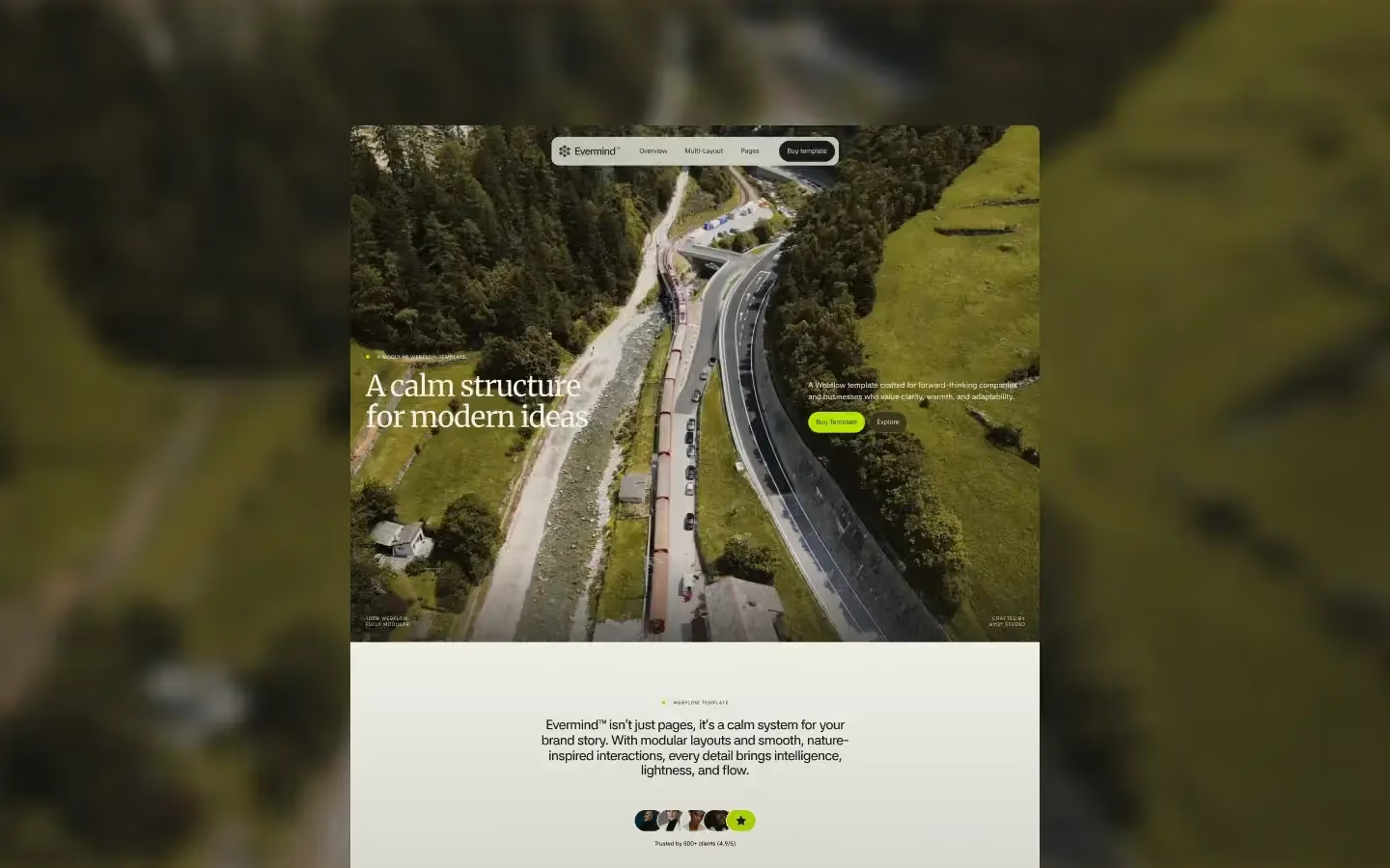
For when the mission is the product and you have real long-form copy to carry. Handles a manifesto better than almost anything else in the library.
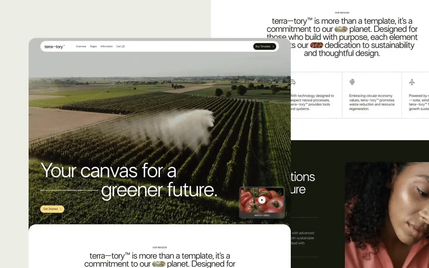
Built for eco-focused companies and green-tech startups. Clean and modern, with CMS-driven blog and careers sections, and ecommerce if you sell as well as advocate.
Scale and reliability are the only two things you're selling, and both are hard to show without falling back on a stock photo of a container ship.
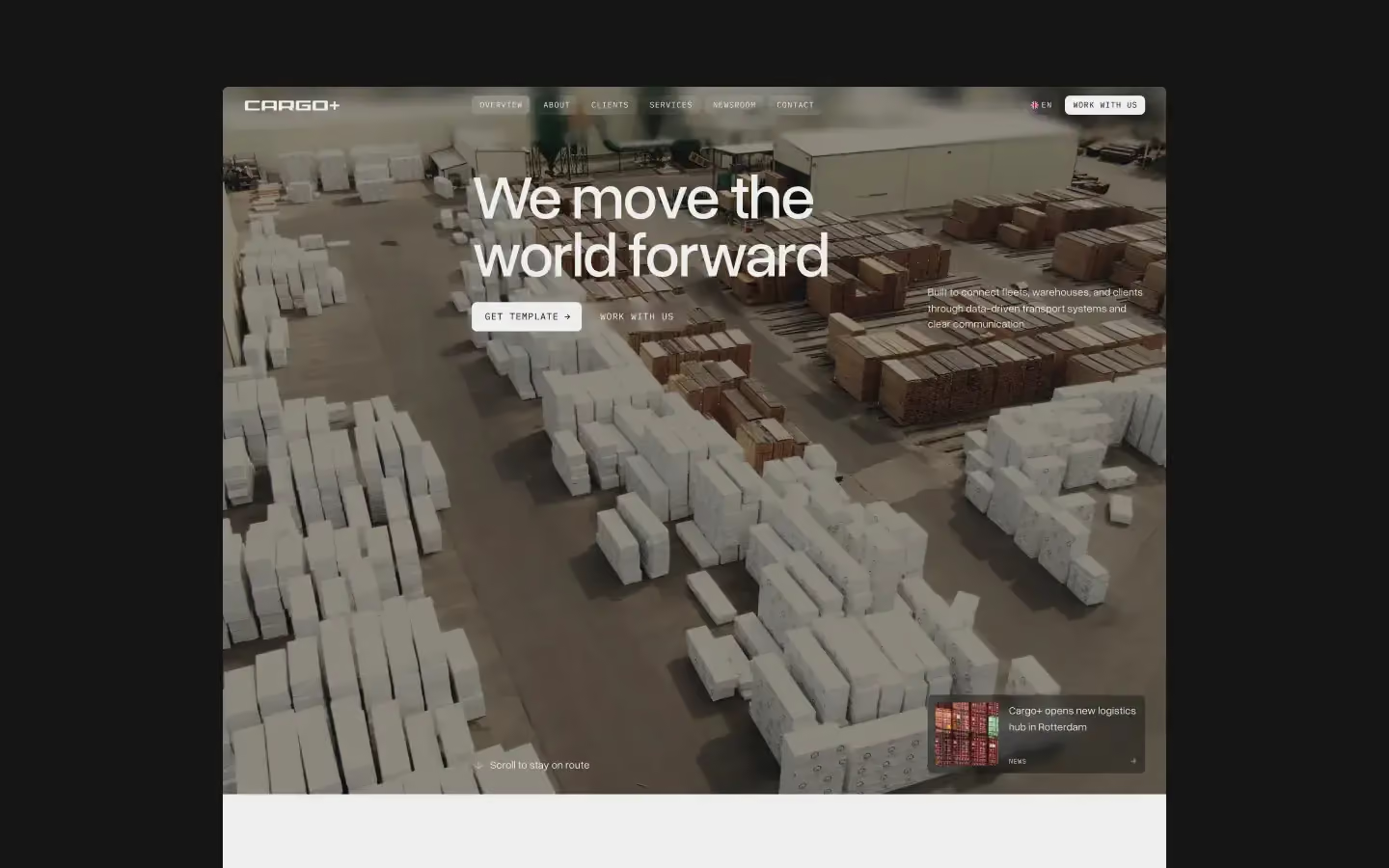
High-impact layouts for logistics and operational services, built to communicate size without the clichés.
Your visitor is usually comparing three open tabs and deciding who to call. Proof and warmth beat polish every time.
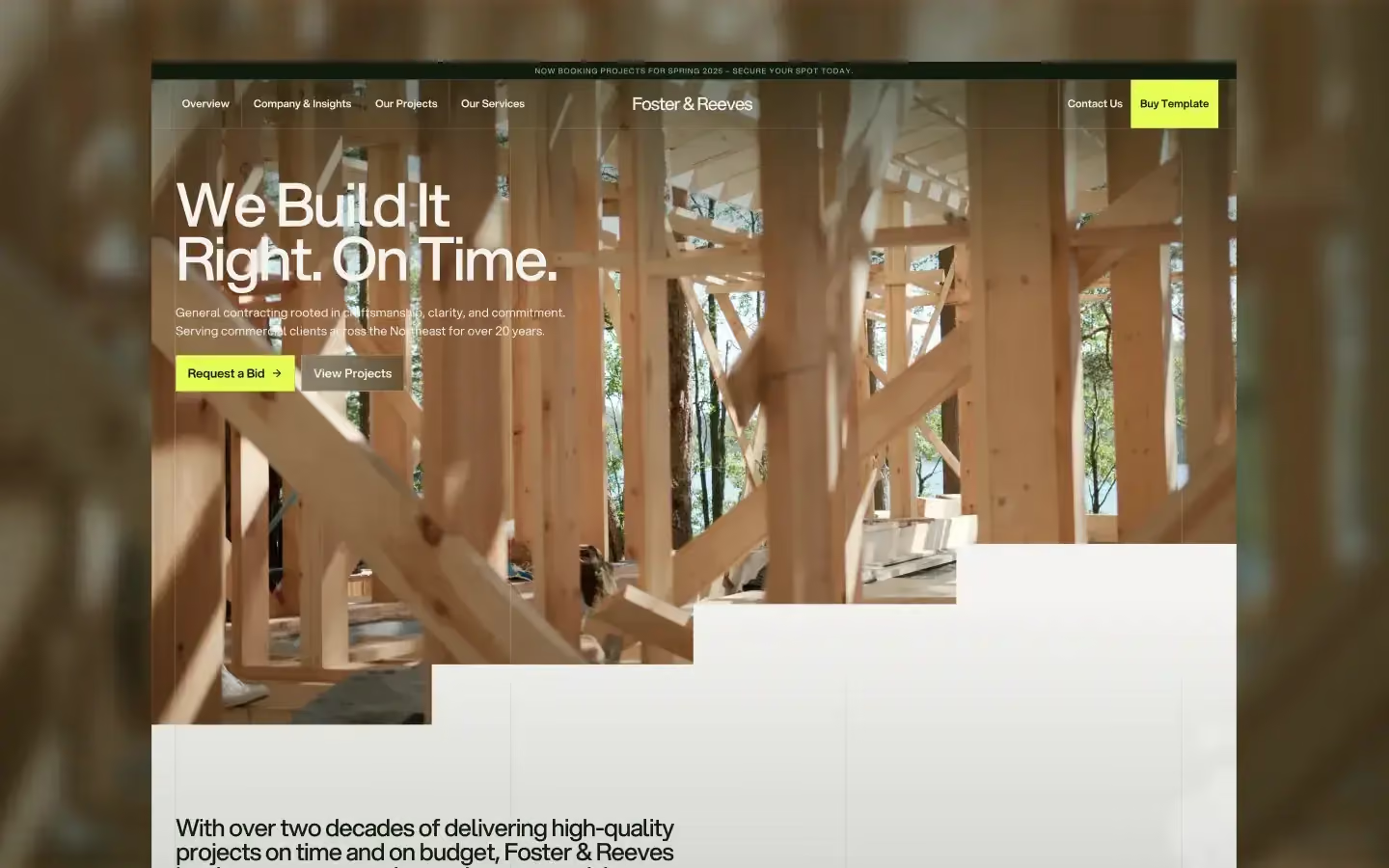
Built around turning projects into clients — before-and-after, service areas, trust signals. For contractors and trades.
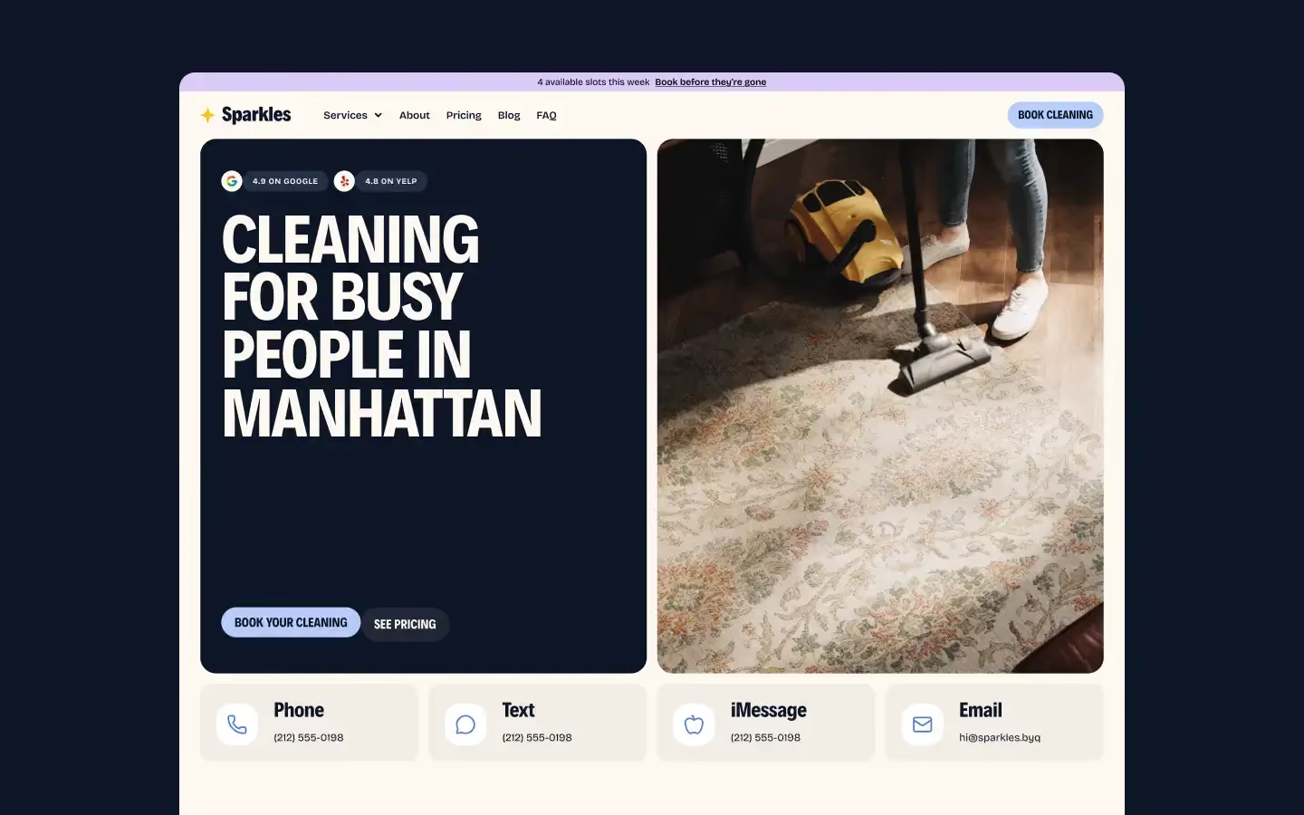
The friendly end: cleaning, home services, anything where warmth converts better than authority.
The real requirement here isn't beauty, it's programming — exhibitions, events, seasons, all changing constantly. Most "creative" templates miss that entirely.
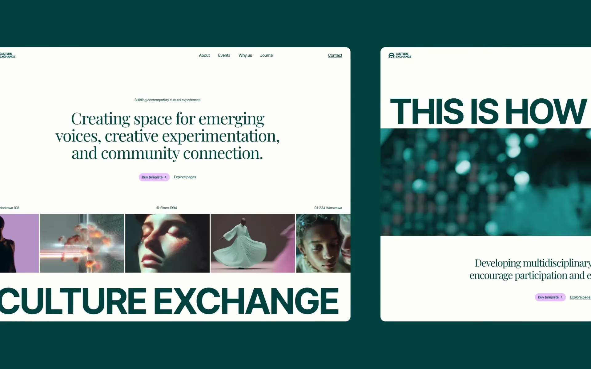
Editorial and CMS-ready, built for a calendar that never stops moving.
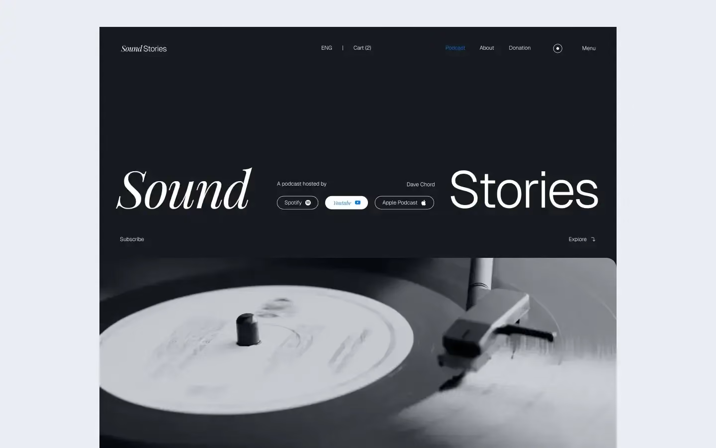
For audio-led programming — recordings, listening sessions, anything built around a running series rather than a one-off show.
Education spans a wider tonal range than almost any other category, from nursery to conservatoire. Getting the temperature right matters more than getting the features right.
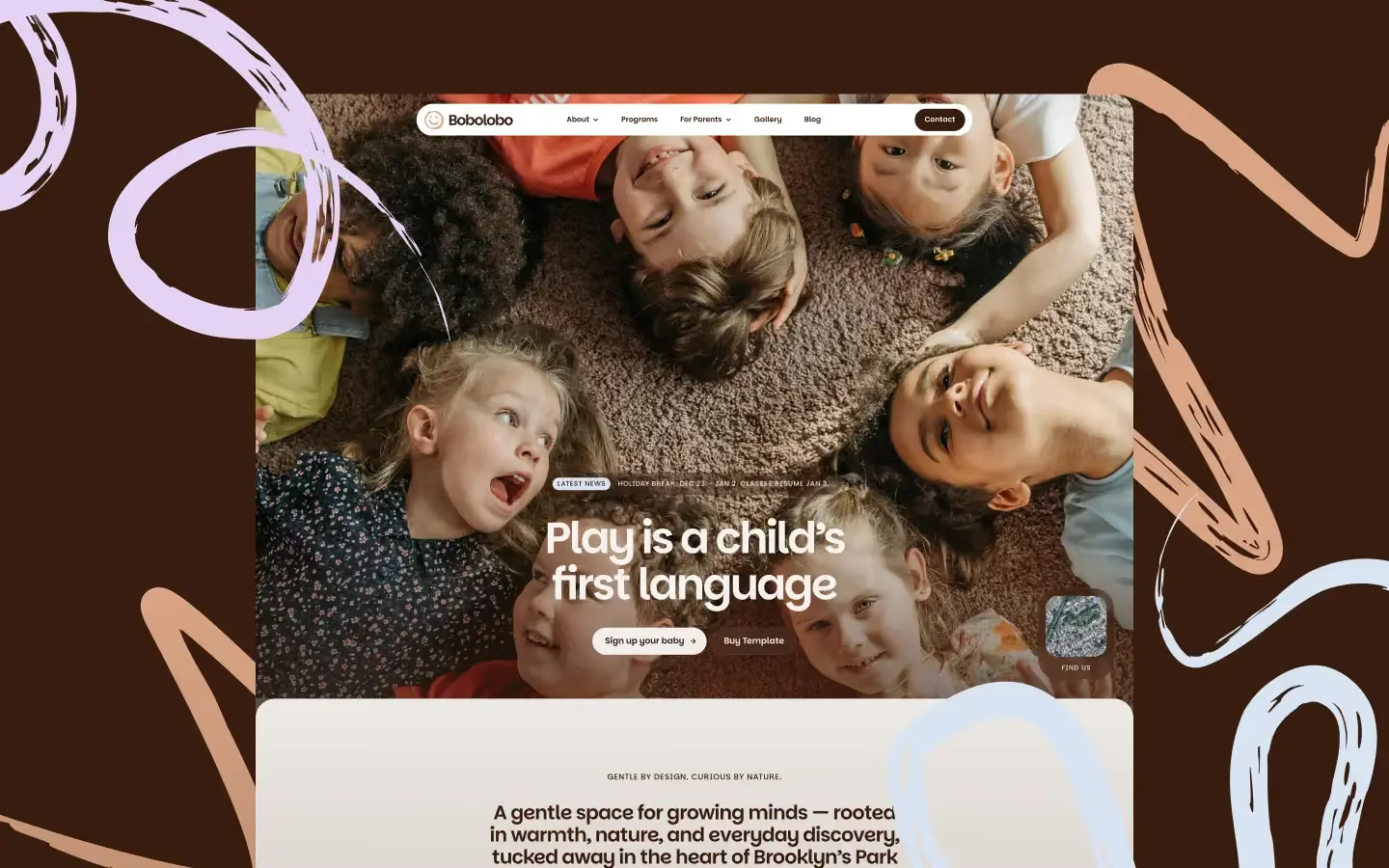
Warm and joyful, made for early learning centres.
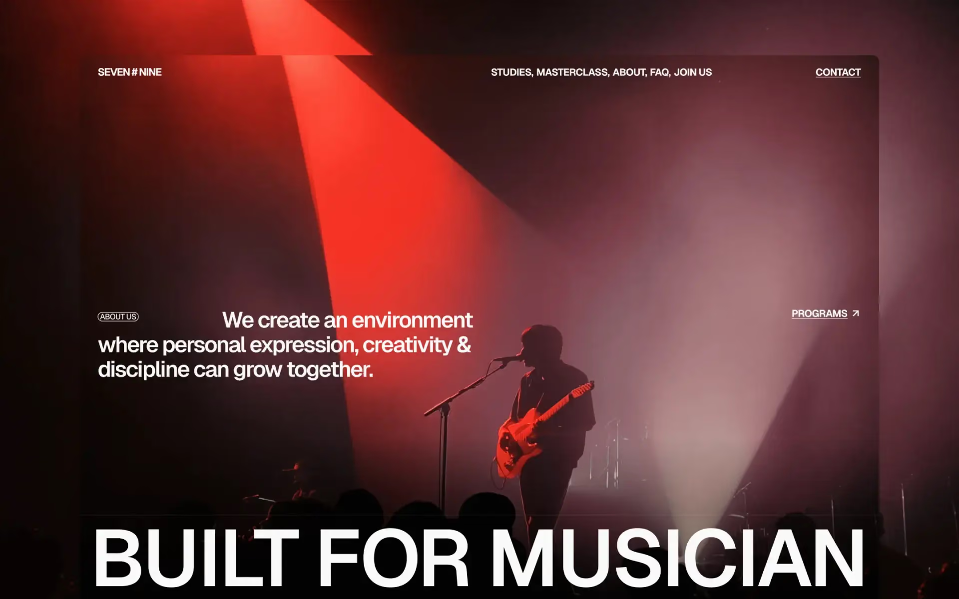
The opposite end entirely. Editorial music education — big type, black and red.

For coaches, educators and course creators. CMS collections for courses, teachers and blog, with ecommerce built in so you can sell programmes directly.
Sometimes the brief hasn't settled yet. Three options that stay flexible without becoming shapeless.
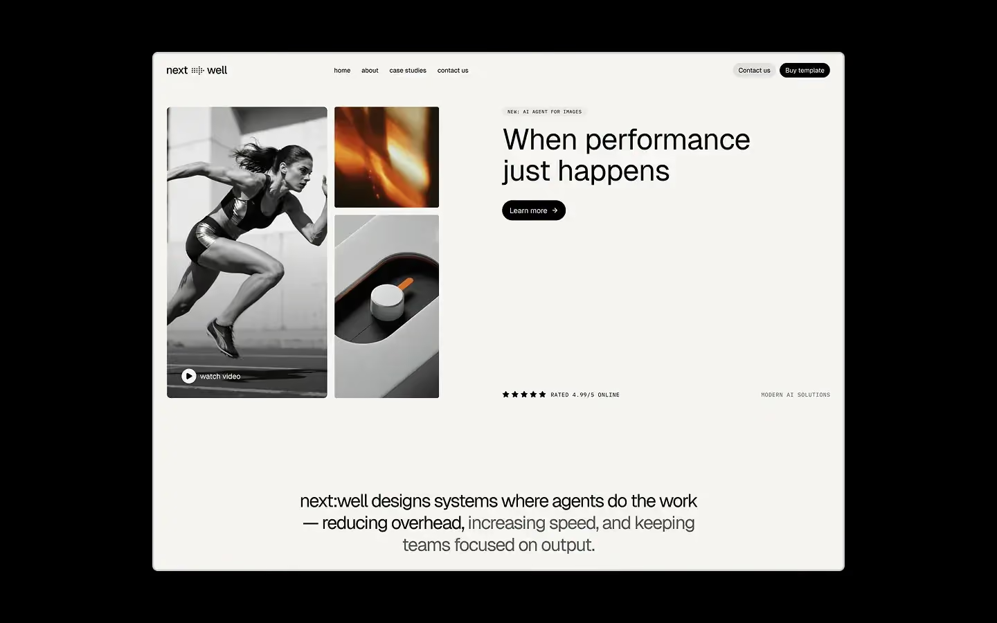
Shared variables, light and dark, Client-First. The right start when you'll still be extending this site in two years.

Warm and editorial — cream tones, serif headlines, and a calm structure that bends to a lot of different briefs. Genuinely multi-purpose.
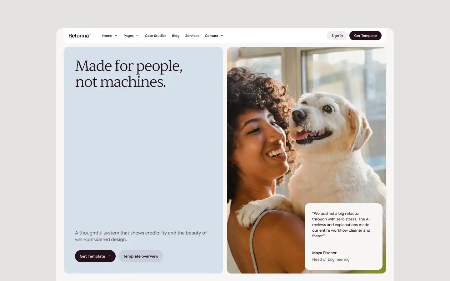
Structured and credible, and more adaptable than it first looks. Good when you know the site has to feel serious but the category is still moving.
Before you commit, run this. It's saved us more time than any other habit.
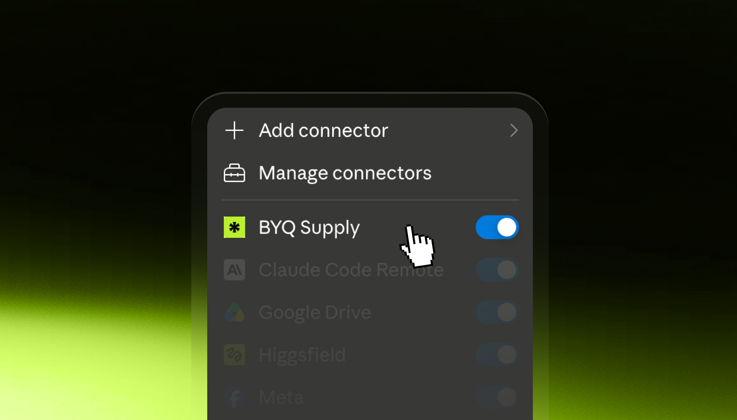
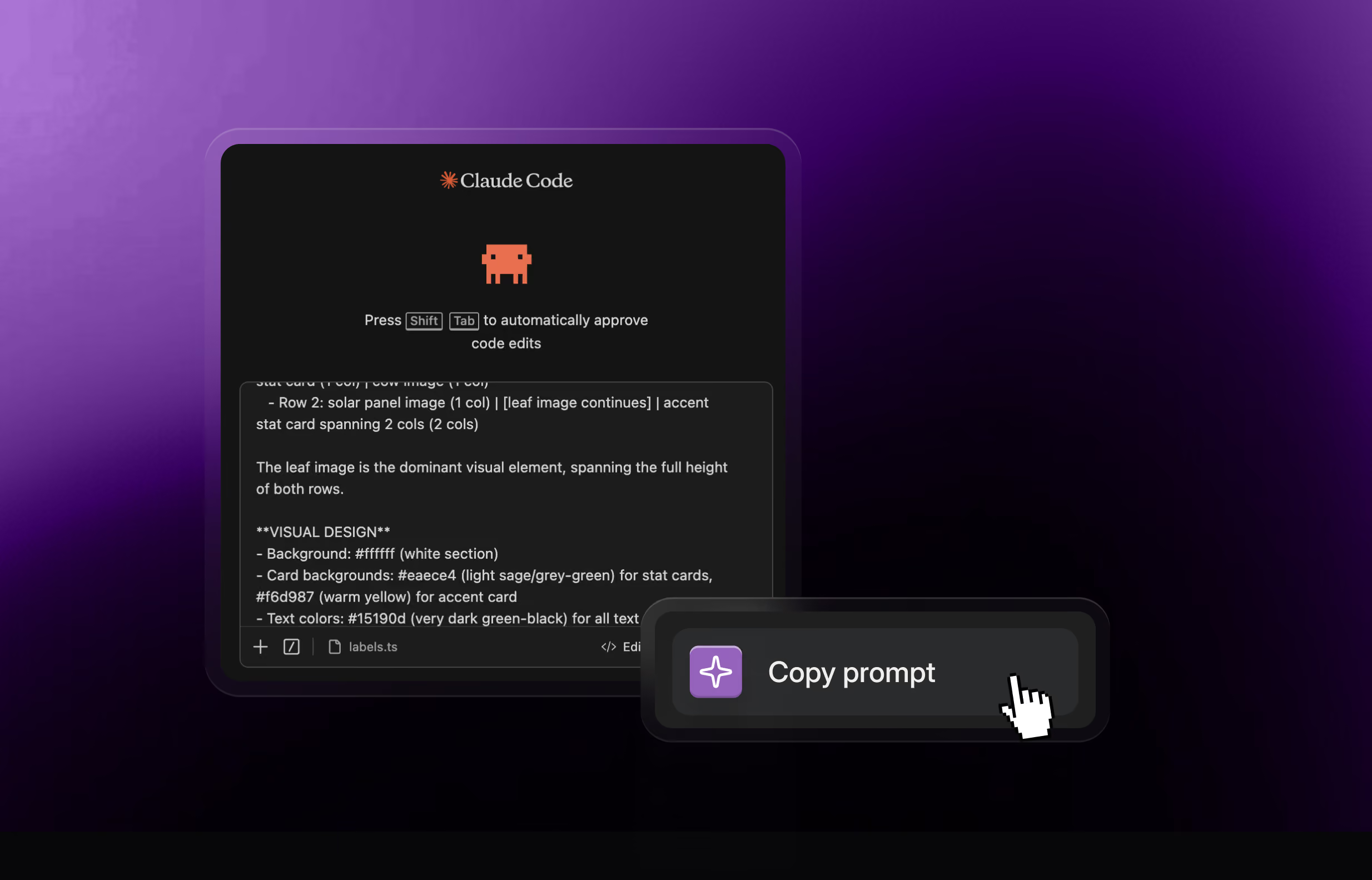
Every template ships with its design system. That means the template isn't just a site — it's a styling foundation you can hand to your AI tool. Start with Halden Miller, feed its design system to Claude Code or Cursor, and every extra section you generate comes out matching the template you bought.
That's the part people miss. You're not buying a fixed site. You're buying a direction you can keep building in.
Want opinions instead of categories? Six templates we'd use on our own projects is the shortlist.