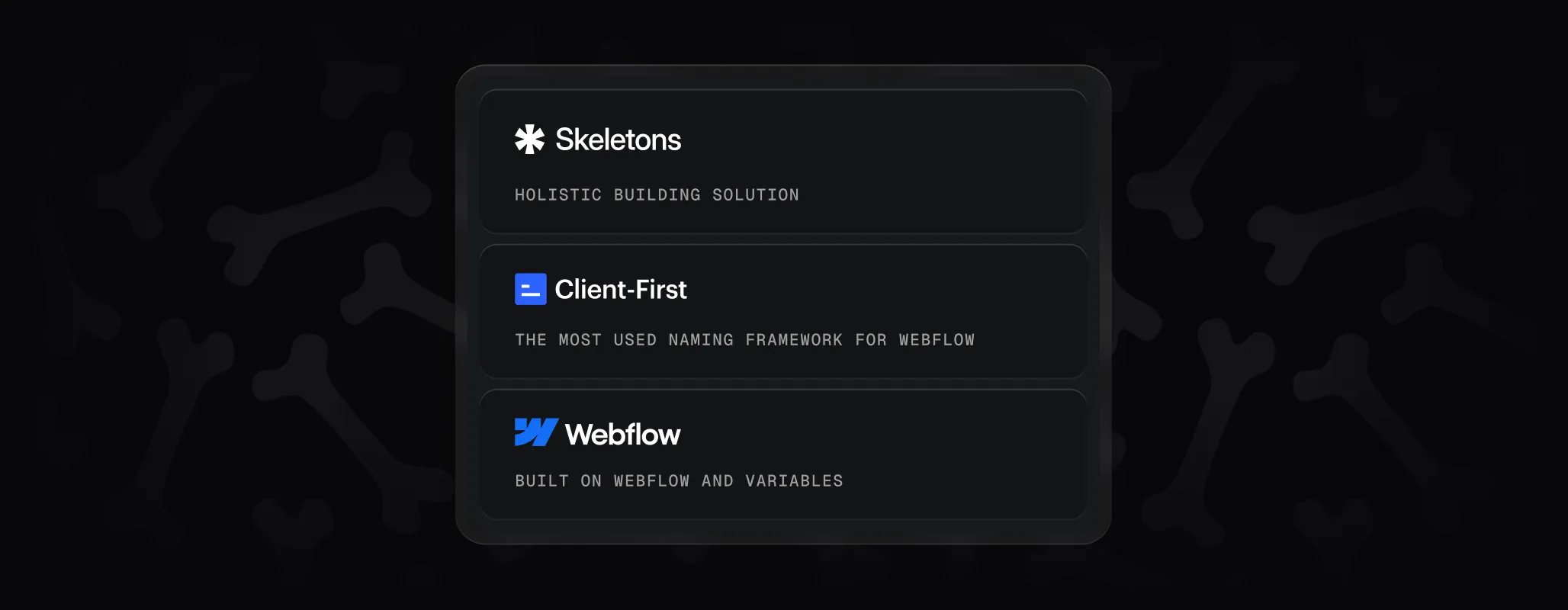
Every website needs structure before it comes to life. That’s what Skeletons are – the framework, the bones of your project, ready for you to add your brand’s colors, content, and style.
We created BYQ Skeletons as a holistic building solution for Webflow. They’re designed around Webflow variables and the Client-First framework, so instead of getting lost in messy classes and endless manual edits, you’re working with a system that adapts to you. Change a variable once, and your entire project shifts with it.
Each Skeleton is slow-designed – crafted carefully, not rushed – so when you start building, you know you’re standing on solid ground. The result? You can move faster, launch sharper, and focus on creativity instead of cleanup.
This is the first version of our knowledge base. It’s here to guide you through best practices, help you understand the flow, and show you how to get the most out of Skeletons. In the future, we’ll expand with video tutorials, real-world examples, and deeper lessons on how we build.
Think of it this way: Skeletons give you the bones. Variables give them life. You bring the final skin, style, and personality that makes the project yours.
Quick Getting Started With Your First Skeletons
Here’s the fastest way to get up and running with Skeletons. Four simple steps, and you’ll have a working project foundation ready to build on.
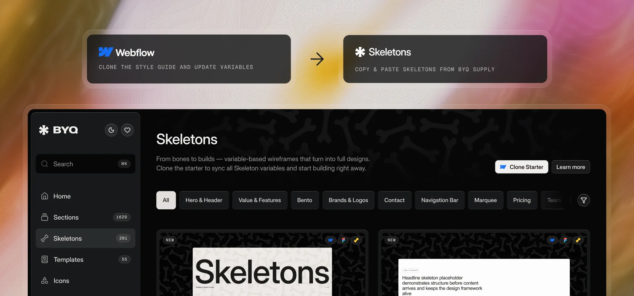
Step 1: Clone the Style Guide
Start by cloning the style guide project. It comes with a clean Client-First setup and all the Webflow variables that Skeletons depend on. We’ll talk more about the style guide in the next chapter.
Step 2: Update Your Variables
Make the project yours by updating the variables. Change layout, typography, colors, radius, or icons, and your brand style flows through the entire project. The next chapter, Variable Anatomy, will dive deeper into how variables work and which ones matter most.
Step 3: Choose Your Skeletons
Go to BYQ Supply and explore the Skeletons library. Use filters like Hero, Contact, Features, or Intro Text, plus layout and animation filters to find exactly what you need.
Step 4: Paste Them Into Your Project
Copy the Skeletons you like and paste them into your cloned style guide project. Because everything is tied to variables, they’ll instantly adapt to your brand.
Quick Flow Recap
Clone the style guide
Update your variables
Choose Skeletons from the library
Paste them into your project
That’s all it takes to get started – a clean, scalable setup without the class clutter or manual restyling.
Overview of the Style Guide Clonable
Everything in Skeletons starts with the style guide clonable project. This isn’t just a page – it’s the base project where all Skeletons are meant to live. Copy-pasting Skeletons will only work if you paste them inside this clonable, since it already has the correct framework and variables baked in.
The clonable is built on the Client-First framework by Finsweet. That means you’re working with clean class naming, consistent page structure, and best practices that scale. But we didn’t stop there — this clonable also comes with the full Webflow variable structure (layout, typography, color, radius, and icon), ready to connect directly with Skeletons.
The Role of the Style Guide
Inside the clonable, you’ll find the style guide page. Think of it as a visual representation of your variables, not a place to make manual changes. For example, if you see a class like <class-tag>button</class-tag>, that class is linked to multiple variables, like: <variable-tag>radius: button</variable-tag>, <variable-tag>color: light 100%</variable-tag>, <variable-tag>font-size: button 1</variable-tag> etc... . To change the look of element with that class, you don’t edit the class — you update the variable (or many variables), and the class updates everywhere automatically.
This rule applies across the board: typography, layout, colors, radius, icons. Always adjust through variables, never by disconnecting or overriding styles.
Project Structure
When you open the clonable, you’ll see two static pages:
Home – the main page where you paste and build with Skeletons.
Style Guide – a reference page that displays how all variables look. You usually don’t need to touch this.
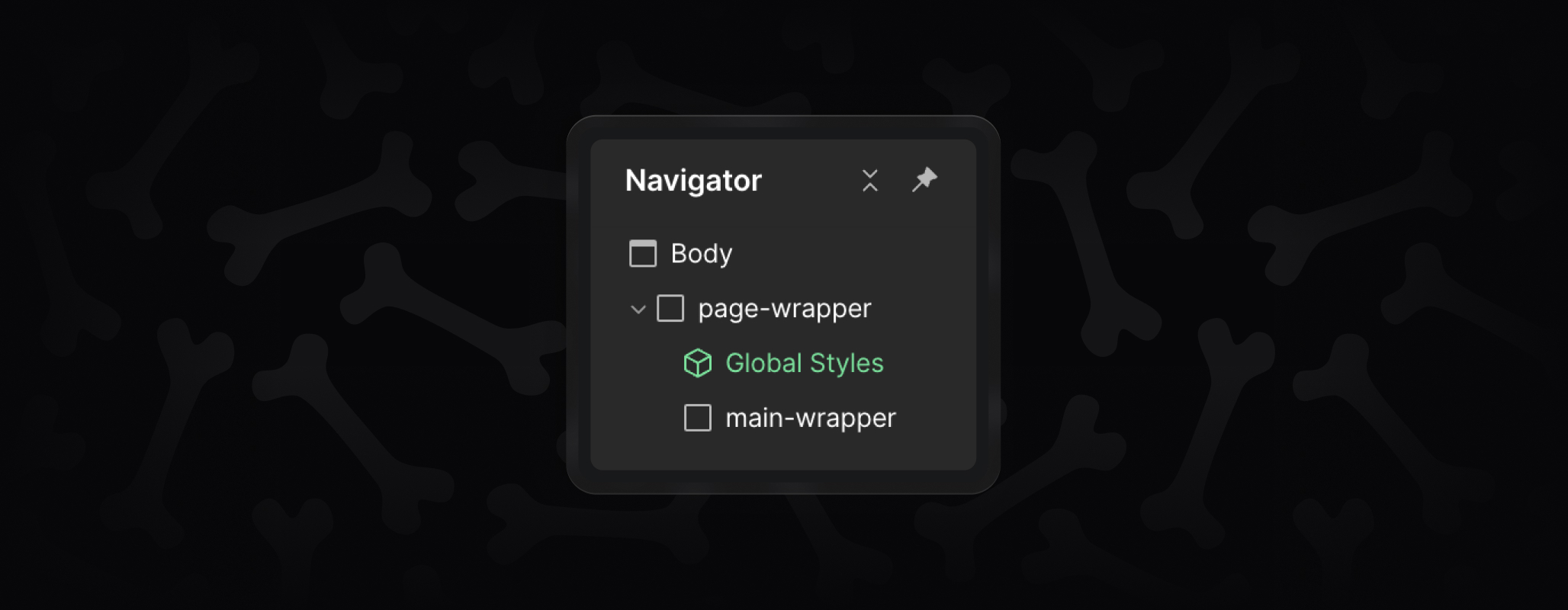
On the Home page, the structure is simple but important:
Page Wrapper – top-level container.
Global Styles – component that ensures consistency.
Main Wrapper – the main content area, tagged <main> for SEO. This is where you paste Skeleton sections.
When creating new pages, just repeat this structure: add a <class-tag>page-wrapper</class-tag>, drop in the Global Styles component, then add a <class-tag>main-wrapper</class-tag> where your sections go.
Why It Matters
The style guide clonable ensures that everything you build with Skeletons is consistent, scalable, and easy to update. With Client-First conventions and variables built in, it’s the foundation that keeps your project clean and makes global changes possible.
Variable Anatomy
Variables are the heart of Skeletons. Instead of editing styles one by one, you adjust them once and watch your whole project adapt. Below is an overview of the variable groups you’ll find in the clonable and how to work with them.
Layout
Layout variables control spacing, section paddings, max widths, grids, and containers.
Spacing – standard increments used across the project. Best to leave these unchanged.
Section Vertical Padding – good to adjust if you want larger or smaller breathing room between sections.
Max Width & Grid – usually left as is, though advanced users can adjust if their design calls for different widths or gaps.
Container (Main / Small) – also typically left alone, but you can widen or narrow containers for specific branding needs.
Typography
Typography variables define fonts, weights, sizes, and spacing.
Fonts – one variable for headings and one for body text. Swap these to set your brand’s typefaces (including custom fonts).
All Weights – system values, don’t change.
Font Weight – safe to adjust. Connect headings, buttons, or labels to different weights if you prefer bold, thin, or medium.
Font Sizes – fully customizable. Update heading sizes, body text, buttons, and labels to match your style.
Line Height & Letter Spacing – fine-tune these after changing font sizes to keep text balanced and readable.
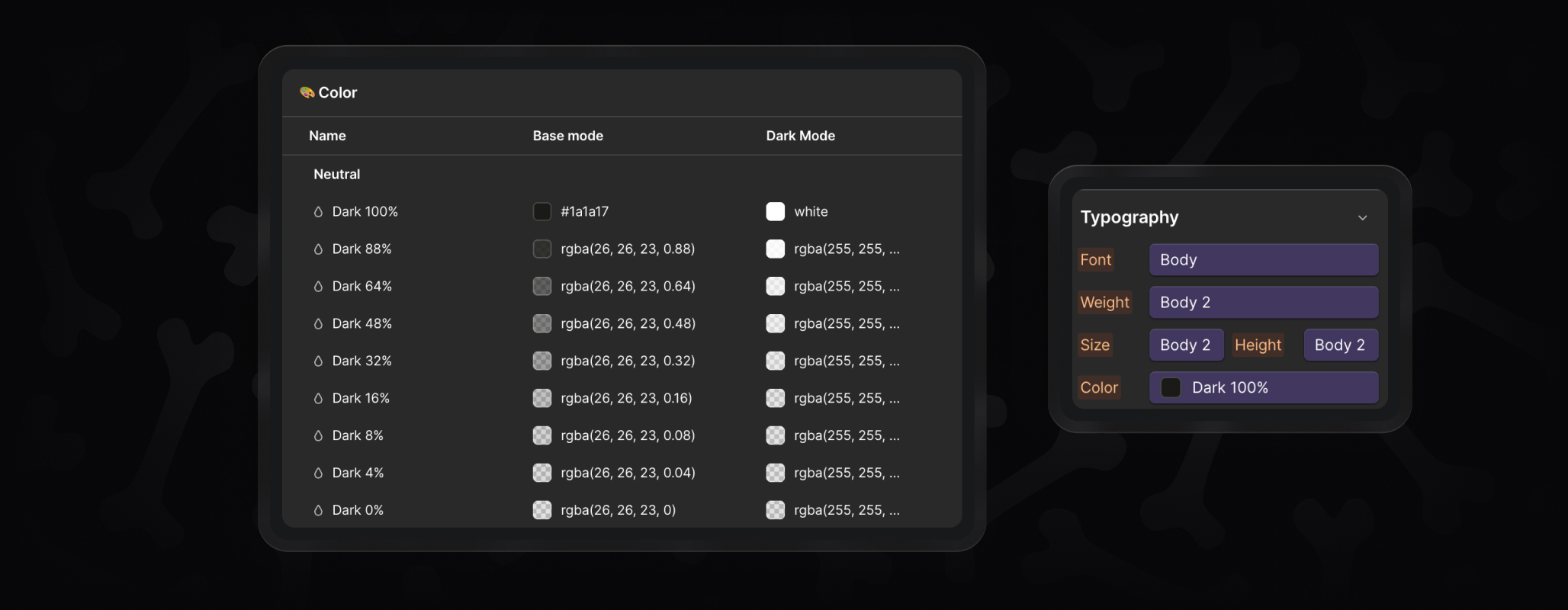
Color
Skeletons come with a light theme by default, but variables cover both base mode and dark mode.
Dark / Light Neutrals – set your primary text colors here. Pick a main dark (for body text) and light (for reversed text), then fill in the opacity steps (88%, 64%, etc.) for borders, hover states, and subtle layers.
Accents & UI – accents for highlights, plus UI colors like error, links, or transparent states.
Radius
Radius variables control corner rounding.
Full – always 100%, leave as is.
Large / Medium / Small / Button – adjust these to match your brand’s overall feel, from sharp and minimal to softer, rounded edges.
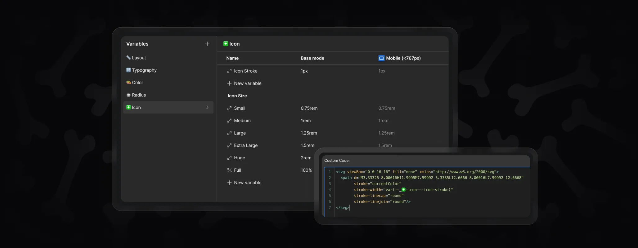
Icon
Icon variables manage icon sizing and stroke.
Icon Stroke – update once, and all embedded icons follow.
Icon Sizes (Small → Full) – generally fine to keep as is, but you can resize globally if your project calls for different proportions.
Key Takeaway
Not every variable needs changing. Use them where it makes sense — fonts, colors, section paddings, radius — and leave the rest as they are to keep things consistent. By relying on variables, you ensure that every Skeleton you paste adapts instantly to your brand without manual restyling.
Skeletons in Action
Once you’ve set up your clonable and started pasting in Skeletons, there are a few important things to understand about how they work in practice. Think of this as your “good to know” guide for building smoothly.
What Happens When You Paste a Skeleton
Each Skeleton section comes with classes already applied. These fall into two groups:
Global Classes – These are the shared classes that come from the style guide itself, like <class-tag>heading-style-h1</class-tag>, <class-tag>text-align-center</class-tag>, <class-tag>label</class-tag>, or <class-tag>button</class-tag>. They are consistent across the whole project and show up in multiple Skeletons.
Section-Specific Classes - These are unique to each section and easy to recognize. For example, if you paste Hero 2, you might see classes like <class-tag>hero2_content</class-tag> or <class-tag>hero2_image-wrap</class-tag>. These classes only exist for that one Skeleton and won’t affect others.
The key rule is simple:
Global classes should never be edited directly. Their styling is controlled by variables.
Section-specific classes are safe to edit however you like.
Why Not Edit Global Classes?
If you manually change a global class, next time you paste a section that includes this class, Webflow will treat it as a variation and create a duplicate (e.g., <class-tag>label</class-tag> becomes <class-tag>label 2</class-tag>). That leads to messy, inconsistent styling across your project.
Instead, if you want to tweak a global element (like adjusting the padding on labels), use a combo class. For example, add <class-tag>is-custom</class-tag> to your <class-tag>label</class-tag>. This way, the base label class stays untouched, and you can apply your custom version wherever needed — without duplication.
Freedom With Section-Specific Classes
Section-specific classes are yours to control. You can change their properties, disconnect variables, or add custom values as needed. Because they only exist for that one section, you won’t run into duplication issues.
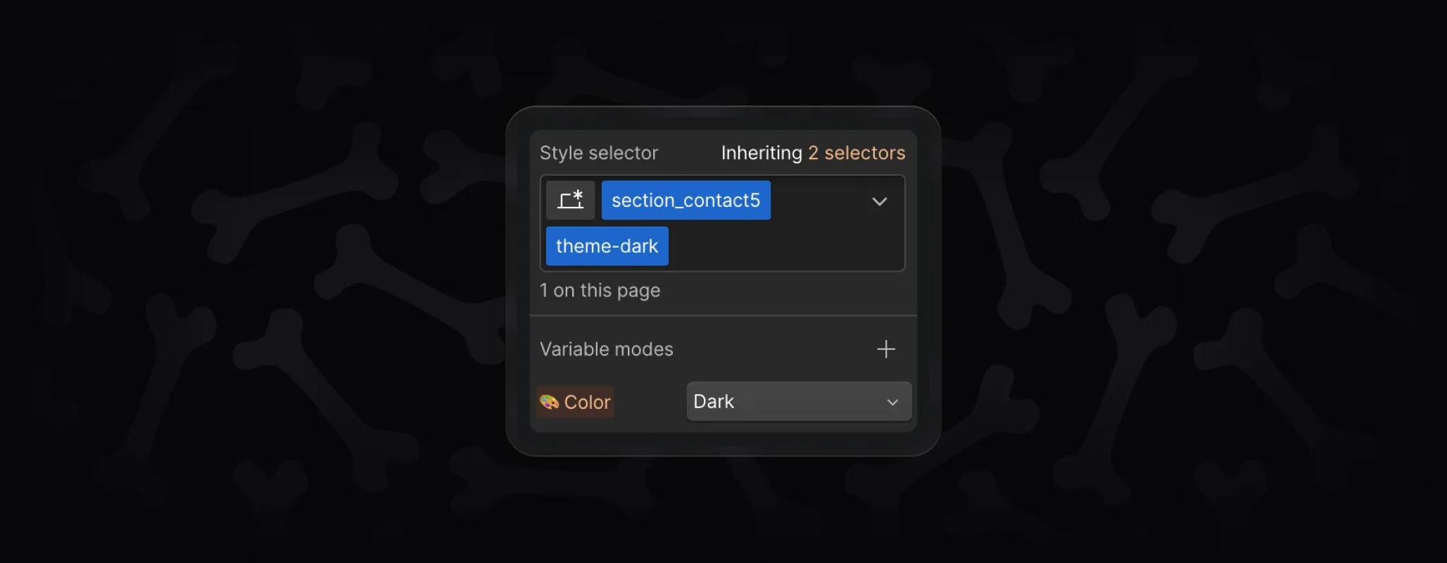
Dark Mode and the theme-dark Class
Skeletons also come ready for dark mode. Each color variable has both a base mode and a dark mode value. By default, Skeletons use the light theme, but you can switch any section — or even a whole page — into dark mode.
To do this, simply add the <class-tag>theme-dark</class-tag> class:
Apply it to a <class-tag>section_section-name</class-tag> if you want just that area to flip.
Apply it to the <class-tag>page-wrapper</class-tag> if you want the entire page in dark mode.
This switches your project to the dark variable set automatically, as long as you’ve filled out your dark mode colors in the variables.
We use cookies to make BYQ run smoother, faster, and smarter. Some are for essential stuff. Others help us improve the product or show you the good stuff. You’re in control.


